If you’ve ever designed a product, you’ve likely heard a stakeholder ask, “So… how usable is it?”
And if you’ve ever answered, “Well, users seemed happy,” you already know how weak that sounds in a meeting with executives.
Usability is too important to be left to gut feel. That’s where the System Usability Scale (SUS) comes in. For nearly four decades, SUS has been the go-to way for UX teams to measure perceived usability in a way that’s fast, reliable, and benchmarkable. It condenses user feedback into a single number i.e. a usability score you can track over time, compare against industry averages, and use to justify design decisions.
In this guide, we’ll explore what SUS is, why it’s still relevant today, how to design a good SUS test, and most importantly, how to interpret results in ways that drive action. Along the way, we’ll spotlight how UXArmy’s SUS Score feature makes this process smoother and more persuasive than ever.
Why Use SUS? History and Relevance of the System Usability Scale
The year is 1986. John Brooke, working at Digital Equipment Corporation, is faced with a challenge: teams are building systems, but there’s no quick, reliable way to measure how usable they are. So he creates a 10-question survey aka the System Usability Scale. The survey is short enough so that users can complete it in just a couple of minutes.
Almost forty years later, the SUS tool hasn’t just survived; it’s thrived. Why?
- Simplicity – It takes less than two minutes to administer.
- Flexibility – Works across products, from banking apps to medical devices.
- Reliability – Cronbach’s alpha often exceeds 0.85, indicating strong internal consistency.
- Benchmarkability – The global average SUS score across thousands of products is around 68.
“SUS is like a thermometer for usability. It won’t tell you where the problem is, but it will tell you if you have one.” – Jeff Sauro, MeasuringU
How is SUS measured? (With Examples)
The SUS questionnaire alternates between positive and negative statements, such as:
- I think I would like to use this system frequently.
- I found the system unnecessarily complex.
- I thought the system was easy to use.
Users respond on a 5-point Likert scale from Strongly Disagree to Strongly Agree.
Scoring works like this:
- For odd-numbered questions: score = (response − 1)
- For even-numbered questions: score = (5 − response)
- Add them all up and multiply by 2.5.
The result is a number between 0 and 100 – but it’s not a percentage. A score of 70 doesn’t mean “70% usable.” Instead, it’s a benchmarkable metric:
- Below 50 => Big usability problems.
- 50–68 => Below average.
- 68–80 => Above average, but room for improvement.
- 80+ => Excellent usability.
“If you want your product’s usability to be in the top 10%, you’ll need a score of 80 or higher.”
– Nielsen Norman Group
Designing a SUS Test That Actually Delivers Insight
Running SUS is easy. Running it well is an art.
- Choose the right participants: The participants should represent your target users, not just colleagues or anyone who passes through the hallway.
- Give them real tasks: SUS works best after participants have used the product in a realistic way.
- Administer immediately: Run the survey right after the session while the experience is fresh.
- Pair with qualitative feedback: SUS tells you what, usability tests or user interviews would tell you why.
- Repeat over time: The power of SUS is in tracking improvement, not just taking a one-time reading.

Participant view of UXArmy System Usability Scale (SUS) on a computer.
Top 5 SUS Mistakes to Avoid in Usability Testing
- Changing the questions or scale: Breaks comparability with benchmarks. Yet sometimes you may need to tweak the text for the questions.
- Treating SUS as diagnostic: The SUS score alone won’t tell you where the problem is. So SUS can’t be run as a Survey.
- Sampling bias: Testing only with power users or a group of users known to each other skews results.
- Overreacting to small changes: A low SUS score must be followed up with a usability improvements action plan. Minor score fluctuations are normal; focus on trends across tests.
SUS Score Case Study: How PennySense Improved Usability by 31 Points
In early 2023, a fintech startup called PennySense set out to launch its first mobile budgeting app aimed at freelancers and small business owners. The founding team believed their unique selling point, essentially a “cash flow forecast” tool, would be a hit. But as launch approached, they wanted a quantifiable measure of usability to present to early investors.
They recruited 12 target users through a mix of personal networks and a local freelancer community. Each participant was asked to:
- Create an account.
- Link a sample bank feed (using mock data).
- Set a monthly savings goal.
- Explore the cash flow forecast tool.
Immediately after completing these tasks, participants filled out the System Usability Scale within a moderated usability session.
First SUS score: 54 – well below the industry average of 68.
The qualitative feedback revealed two main issues:
- Navigation confusion – Users struggled to find the forecast tool, buried three levels deep in menus.
- Terminology mismatch – “Cash flow forecast” felt too technical; users expected simpler terms like “Income & Expenses” or “Money Outlook.”
Armed with these insights, the team redesigned the navigation to bring the forecast tool into the main dashboard and simplified labels throughout the app.
Second round (6 weeks later):
They tested again with 10 new participants from the same target audience. Tasks remained identical to keep results comparable.
SUS score jumped to 72 – now above average. Feedback showed the changes had removed most navigation friction, but onboarding still felt “a bit too long” for some users.
The team then redesigned the onboarding flow from four steps to two, using progressive disclosure for advanced settings.
Third round (pre-launch):
Testing with 15 users (a mix of freelancers and small business owners) produced a SUS score of 85, placing PennySense in the top tier of usability benchmarks. Users described the app as “easy to pick up” and “surprisingly intuitive for financial software.”
When presenting to investors, the founders didn’t just share the latest SUS score – they showed the progression chart from 54 => 72 => 85, paired with actual user quotes from each phase. The combination of hard numbers and human stories made the improvement undeniable, helping them close a successful seed funding round.
Spotlight: The UXArmy SUS Score Feature
Now, let’s talk about what happens when you combine the power of SUS with the right platform.
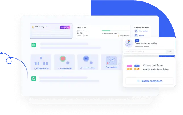
UXArmy takes a process that traditionally involves manual setup, calculations, and spreadsheet charting, then turns it into an automated, visual experience.

UXArmy System Usability Scale (SUS) Dashboard
Here’s how it works in UXArmy?
#1 Add SUS to your test: Choose SUS as an in-built, readymade standard questionnaire in your UXArmy Usability study setup. For extended flexibility, you can edit the SUS questions as well. If your audience is not using English as the main language, you can use the in-platform translation feature to automatically translate the questionnaire.
#2 Run your test: Participants complete the usability tasks and then fill out the response to SUS questions right inside the platform.
#3 Get instant scoring: UXArmy platform automatically calculates the score.
#4 See benchmark context: Scores are plotted against global benchmarks – “Below Average,” “Above Average,” “Excellent”.
#5 Track over time: By creating multiple tests with SUS score, SUS trends across versions of usability tests can be compared to show progress or spot declines before they become problems.

Editing and Translations are supported in UXArmy System Usability Scale (SUS)
Case Study: Enterprise SaaS and UXArmy
In late 2022, a mid-sized Enterprise SaaS company, TaskiSphere, was facing a growing challenge: despite strong sales numbers, customer churn in the first 90 days was higher than expected. Customer Success suspected that onboarding friction in their project management platform was to blame, but the Product team needed hard data before committing to a redesign.
They decided to run quarterly usability benchmarking using the System Usability Scale via UXArmy.
Quarter 1 Benchmark:
The UX team recruited 20 existing customers – split evenly between new accounts (less than 30 days in) and mature accounts (6+ months).
Participants were asked to:
- Create a new project.
- Assign tasks to team members.
- Generate a progress report for a client.
At the end of the task sequence, participants completed the SUS questionnaire embedded directly in the UXArmy platform.
- Overall SUS score: 62 – slightly below the 68 average.
- Segment insights:
- New users: average score of 55, citing “too many steps” during setup.
- Experienced users: average score of 69, citing “occasional slow load times” but generally comfortable navigation.
- New users: average score of 55, citing “too many steps” during setup.
UXArmy’s visual dashboard made these differences obvious to stakeholders, with separate benchmark bands for each user segment.
Action Taken After Q1:
The Product team simplified the onboarding flow from five setup screens to three and introduced an “Express Setup” option that let new accounts skip non-critical steps.
Quarter 2 Benchmark:
Testing the same three core tasks with 18 participants (half new, half experienced users) yielded:
- Overall SUS score: 74 – now above average.
- New users improved most, scoring an average of 71 (a jump of 16 points).
Qualitative feedback indicated onboarding was now “quicker” and “less intimidating,” but several experienced users noted that generating a progress report still felt “clunky” compared to competitors.
Action Taken After Q2:
The team overhauled the reporting module, reducing the number of clicks from seven to three and adding export presets.
Quarter 3 Benchmark:
The next test, run with 20 participants, showed:
- Overall SUS score: 83 – in the “Excellent” usability range.
- New users: 79
- Experienced users: 87
With the trend chart displaying the quarter-by-quarter climb (62 => 74 => 83), the Product Manager presented the results to the executive team during the budget planning cycle. The clear correlation between design changes and SUS score improvements, plus the strong visual presentation from UXArmy, secured funding for further UX initiatives without pushback.
How Various Roles Use SUS Scores
One of the biggest strengths of the System Usability Scale is that it speaks a universal language – numbers – but is flexible enough to be interpreted differently by different stakeholders. The same SUS score can spark very different conversations depending on who’s in the room.
Designers: Validating and Guiding Design Decisions
For designers, a SUS score is a litmus test for whether recent changes are having the desired impact.
- Example: A designer reworks a checkout flow to reduce cognitive load. If the SUS score climbs from 65 to 78 post-release, that’s confirmation the redesign improved perceived usability.
- How they use it: Designers pair SUS results with usability session recordings or heatmaps to identify why certain screens perform better, then refine micro-interactions or layout.
- Key takeaway: Designers view SUS as a “pulse check” that either validates their hypotheses or signals it’s time to revisit core workflows.
UX Researchers: Benchmarking and Communicating Trends
Researchers think in terms of longitudinal data.
- Example: A UX researcher runs SUS surveys every quarter for a product. Over 18 months, scores move from 60 => 67 => 71. This slow but steady climb can be used to argue that the UX team’s roadmap is improving the product.
- How they use it: They analyze SUS alongside qualitative data, break results down by user segment, and compare against industry benchmarks.
- Key takeaway: Researchers see SUS as a longitudinal benchmark – a way to measure and communicate the health of a product’s usability over time.
Product Managers: Prioritizing the Backlog and Justifying Investment
PMs live in the intersection of customer needs and business priorities.
- Example: If a feature with high strategic value has a SUS score far below the product average, the PM might prioritize fixing it over adding new features.
- How they use it: SUS helps PMs prioritize the backlog by focusing on usability pain points that block adoption or retention. They also use score improvements to justify budget requests for UX work.
- Key takeaway: PMs treat SUS as a risk-and-reward tool – low scores in critical areas become top priorities, while high scores free up bandwidth for innovation.
Executives and Business Stakeholders: Tracking Product Health at a Glance
For executives, SUS is often part of a broader KPI dashboard.
- Example: A SaaS company’s leadership team reviews monthly KPIs, including revenue, churn rate, and SUS score. A sudden drop from 82 to 73 triggers an urgent cross-team review before the decline impacts renewals.
- How they use it: Executives rely on SUS for a quick, standardized measure of how “usable” the product feels to customers – often correlating it with customer satisfaction or NPS.
- Key takeaway: For leadership, SUS is an early warning system for customer experience issues that could affect the bottom line.
Future of SUS: Where It’s Headed
SUS has stood the test of time, but its application is evolving:
- AI analysis: Platforms are starting to combine SUS scores with AI-driven qualitative analysis to pinpoint issues faster.
- Integration with product analytics: Merging SUS with usage metrics gives a fuller picture.
- Continuous testing: Instead of quarterly, some teams run micro-SUS surveys after specific feature releases.
“The future of usability measurement is hybrid – quantitative scores like SUS alongside automated qualitative insights.”– Theresa Neil, UX Strategist
The Takeaway
SUS is much more than a quick online survey! It’s a bridge between subjective user impressions and objective, actionable insight. It doesn’t replace deep usability testing, but it gives you a reliable starting point and a number you can track over time.
And when paired with UXArmy’s SUS Score feature, the process becomes faster, clearer, and more persuasive. This way SUS helps you make the case for design improvements with confidence.
Whether you’re a junior UX researcher running your first study, a mid-level designer refining flows, or a product manager seeking stakeholder buy-in, SUS can be your usability compass. Use it well, and you’ll not only know where you stand. You will know exactly where to go next.
Frequently asked questions
Can I use SUS for prototypes?
Yes, but frame expectations. Users know it’s a prototype, so scores may be lower.
How many users should I test with?
8–12 participants can show trends; 20+ gives better statistical reliability.
Is SUS only for software?
No. It’s been used for hardware, websites, mobile apps, and even appliances.
Should I translate SUS into other languages?
Yes but use validated and localized translations to maintain reliability.
How often should I run SUS?
At major milestones, pre-launch, after major updates, and periodically for benchmarking.
What’s a “good” score?
Above 68 is above average; 80+ is excellent.
What is the SUS score on the system usability scale?
What is a System Usability Scale (SUS)? The system usability scale (SUS) is a standardised questionnaire (survey) used to measure the perceived usability of a system (product). It provides a score u003cstrongu003efrom 0 to 100, where higher scores indicate better usabilityu003c/strongu003e
What is the most SUS number?
0 to 100u003cbru003eu003cbru003eIt can be used to rate the usability of any system: websites, online stores, and online applications, but also mobile phones, computing systems, software, call centers, and even phone directories. The SUS rating is a number from u003cstrongu003e0 to 100u003c/strongu003e. The higher the SUS of your site, the easier it is to use.ed above average.
When should a SUS test be run and how do you get meaningful insights?
Administer SUS right after realistic task sessions with representative users. Pair scores with user interviews or usability testing platforms for qualitative insight. Repeat tests over time to track usability trends.