Imagine visiting a new town without any road signs, routes, or even names for the places you want to go! You’d probably feel lost, frustrated, and maybe even a little panicky.
Well, that’s how it feels for users trying to navigate a poorly designed website or app.
Just as we rely on maps and GPS to navigate in the real world, navigation is super important in the digital world, too. It’s more than just finding a specific page, it’s about creating a smooth and easy-to-use experience that makes users want to explore, stay engaged, and have a great time!
This article will explore navigation testing, its importance, key questions to consider, examples, tools, and the best practices that make your navigation rock.
What is Navigation Testing & why does it matter?
Navigation testing ensures users can easily find what they need on your website or app. It analyzes menus, calls-to-action, and search functions to eliminate confusion and frustration.
Poor navigation has serious consequences: lost users, low satisfaction, and missed opportunities. In my usability tests, I’ve witnessed users abandon websites when lost.
Keep reading. I’ll explain all the reasons why testing matters so much.
Why should you do Navigation Testing?
Effective navigation offers more benefits than merely providing a smooth user experience.
Happy Users, Happy Satisfaction.
If users can’t find what they’re looking for, they’ll become frustrated and leave. Navigation testing ensures your site is easy to explore and intuitive.
In turn, satisfied users who feel in control will be more likely to engage longer, return, and eventually become loyal customers and advocates.
Minimize Frustration and Confusion.
If users feel lost, they’ll give you bad reviews and ratings. Navigation testing can help identify confusing labels, broken links or illogical site structures that confuse users.
A clear navigation structure and easy-to-follow wayfinding can guide users to find what they are looking for.
Boost Conversions and Achieve Goals
Poor navigation drives users away. If they can’t find what they need quickly, they’ll likely turn to competitors instead. Navigation testing lets you identify where users struggle on your site.
Effective navigation offers a smooth and seamless experience that enables users to achieve their goals quickly and easily, avoiding frustration and abandonment.
Boost SEO and Online Visibility.
Search engines like Google rely on site navigation to understand its structure. If your sitemap and keywords are unclear, Google will not crawl your website.
A well-structured navigation can enhance your search engine rankings, making it easier for users to find your site.
Pro Tip: Did you know poor navigation drives customers away? Forbes reveals that vague website labels cause confusion and loss of business.
Methods to Test Navigation
So, how do we know if our navigation is working? Let’s explore some practical ways to gather user feedback.
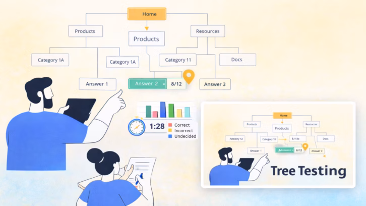
Tree Testing
Tree testing evaluates the structure of your site or mobile app. It helps identify problems with information architecture and labeling.
How it works: Participants are asked to find specific items within a text-based version of the site’s hierarchy, similar to a tree diagram, but without visual design elements.
→ Try your first tree test with these tree testing tools.
Usability Testing

Observing how users interact with your website or prototype helps identify usability issues, including navigation. This analysis offers valuable insights into the overall user experience.
How it works: Participants complete tasks as designers observe their actions and responses. All will be recorded, though some details may be missed.
UXArmy helps capture and identify emotional reactions and enables you to review screen and video recordings to understand the frustration caused during site navigation.
Furthermore, it offers features like path analysis and heatmaps that go beyond basic metrics (e.g., task completion) and thoroughly analyze site performance and navigability.
→ Stop guessing; start testing usability with templates on UXArmy. Alternatively, learn how to conduct usability testing effectively.
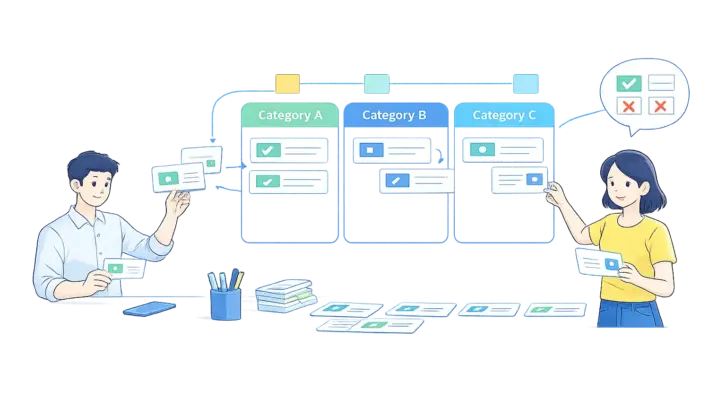
Card Sorting

Card sorting is a method for understanding how users naturally group information so you can organize your website or app in a way that makes sense to them.
This can be done through various card sorting methods, including open, closed, and hybrid approaches.
How it works: Participants are given labeled cards and asked to group them in a way that feels meaningful to them.
→ Looking to organize your navigation? Start testing with card sorting on UXArmy.
A/B Testing

Testing two versions of your webpage or app can help you identify which achieves better outcomes (e.g., different button styles, button labels, or visual cues such as pictures or icons). This can optimize conversions, preferences, and clicks.
How it works: In A/B testing, users are randomly shown either version A or B. We then track key metrics like click-through rates or conversions to see which version performs best.
→ Discover more about the power of A/B testing. Or, start your first test with a template.
Key questions to ask during Navigation Testing
Thought-provoking questions encourage deeper thinking and uncover valuable insights.
Here are some key questions to consider during navigation testing:
Task-Oriented:
- “Can you please show me how you would find [specific information/product/page] on this website?” (This core question can be tweaked to fit many different situations or contexts.)
- “Where do you expect to find [information/product/page] easily?” (Gauges the initial understanding of the site’s structure.)
- “As you’re looking for [information/product/page], what are you thinking or feeling?” (Uncovers the user’s thought process and potential frustrations.)
- “What would you do next if you couldn’t find [information/product/page] using the navigation?” (Explores alternative strategies and identifies dead ends.)
Understanding and Clarity:
- “Does the navigation make sense to you? Why or why not?” (Gets direct feedback on the clarity and logic of the navigation.)
- “What do you expect to find when you click n [specific link/menu item]?” (Check if labels and categories are intuitive.)
- “Is there anything confusing or unclear about how the website is organized?” (Identifies specific pain points in the navigation.)
Overall Experience:
- “Overall, how would you rate the navigation of this website?” (Gets a general sense of the user’s satisfaction with the navigation.)
- “How easy or difficult was it to find [information/product/page]?” (Gauges the overall usability of the navigation.)
- “What could be improved about the navigation of this website?” (Encourages suggestions for specific improvements.)
Tailoring these questions to your specific testing goals and the context of your website or apps is essential.
Most importantly, we should encourage participants to think aloud about their thoughts during the test, to gain valuable insights into their behavior.
Best practices for effective Navigation Testing
Effective navigation is necessary for enhancing user experience and improving customer satisfaction.
Here are the best practices for navigation testing.
- Know what to test before testing. Can users find specific items? Is the checkout process smooth? Are any menu labels confusing?
- Test with the right people. Participants should closely match your target audience to provide realistic feedback based on their experiences with similar products.
- Give realistic tasks and be specific. To truly connect with your audience, task scenarios must mirror users’ real-world actions and experiences on your site.
- Use a mix of methods and be creative. Don’t rely on one method. Combine usability testing, tree testing, and card sorting for a holistic navigation view, avoiding blind spots.
- Test early and regularly. Start testing navigation early in the design process, even with rough prototypes, to catch issues and prevent rework later.
- Don’t waste time; use testing tools. Tools like UXArmy track navigation and analyze data, including click patterns with heatmaps and completion rates, to identify areas for improvement.
- Don’t overlook mobile. As user behaviors vary, ensure your navigation works well on phones and tablets. Test thoroughly, especially for high-traffic groups.
You might wonder if these practices are just theories, but can this kind of testing actually work? Let me show you.
The Amway case study showcases how UXArmy improved online sales by 187% through improved navigation and website redesign.
Examples of Good vs. Bad Navigation Design
Navigation is crucial in digital products. Imagine a website without navigation; User would feel lost and frustrated. Consequently, they would leave in anger.
Let’s look into examples of good and bad navigation design.
Good Navigation Design
- Make it Visible and Accessible.
Users interact with websites and mobile apps using clear and accessible navigation. The primary navigation must be consistently placed for visibility.Sticky menus enhance accessibility by offering continuous access to site navigation, eliminating the need for users to scroll back and improving overall usability.UXArmy’s website is easy to navigate with a sticky menu at the top and two different button styles. - Optimize for Mobile.
Mobile users face unique challenges, including touch interaction and limited screen space.Effective mobile navigation tackles these challenges through intuitive touch targets, universal icons, and short and clear menu labels to make essential navigation elements easily reachable.Clean and straightforward mobile menu design on UXArmy’s website. - Clear and Descriptive Labels.
Effective navigation relies on clear, descriptive labels or brief descriptions of menu items. This not only guides regular users but crucially those unfamiliar with jargon.Descriptive labels enhance SEO by incorporating relevant keywords, which search engines use when indexing websites.
Bynder explains labels clearly, helping users know what to expect from each product feature.
Bad Navigation Design
- Overwhelming Navigation Menus.
Content-heavy websites face a navigation challenge: preventing user overwhelm. Cluttered menus can make it difficult for users to find what they need.A well-organized menu aligns with user mental models. Gov.uk provides a compelling example of this method, offering straightforward and intuitive navigation. - Lack of Feedback and Guidance.
Poor feedback and guidance in website navigation can leave users feeling lost. Without this guidance, they struggle to proceed to the next step.Progress indicators are essential for multi-step forms and web pages, as they help users know how many steps remain. - Hidden or Inconsistent Navigation Placement.
Inconsistent navigation impairs usability. When menus and buttons shift from page to page, users find it hard to locate content, wasting time and focus.
Consistent navigation placement across all pages helps users know where to find elements (menus, links, buttons), reducing the need to search and relearn navigation.
Analyzing navigation test results & implementing improvements
When analyzing navigation test results, we want to understand what is happening, why it happens and how to improve it.
Step 1: Gather and Organize Data
Firstly, we must collect data to discover specific navigation problems and better understand the issue.
- Combine data from all testing methods (usability testing, tree testing, card sorting, etc.) into one place.
- Group similar issues and observations together (e.g., “difficulty finding product X”, “confusing menu labels,” and “unclear site structure”).
- Use numbers to represent the frequency of issues (e.g., “7 out of 10 users struggled to find the pricing page”).
Be specific when possible. For example, “Users struggled to find the product page” is less helpful than “7 out of 10 users clicked on ‘Services’ instead of ‘Creations’ when trying to find the product page.”
Step 2: Identify Key Problem Areas
Analyzing the frequency, volume, and patterns of user feedback helps to identify critical issues affecting user experience and business goals.
Prioritization is essential for effective problem-solving and improvement efforts. Therefore, prioritize these issues according to their impact and severity (e.g., minor, major, critical).
Step 3: Analyze the “Why” Behind the Issues
Don’t just fix symptoms, but find out the root cause. Investigate why users faced this issue by:
- Analyzing user actions and comments to uncover their thought process.
- Evaluating the site’s structure, labeling and organization to identify the underlying issues.
Step 4: Design and Develop
After completing your investigations, create potential solutions for each problem based on usability principles, technical feasibility, and resource constraints.
We know we can’t fix everything, but we should choose the most practical and feasible options to implement. Once more, it’s crucial to prioritize again in this phase.
Remember, document all navigation changes and justifications so the design and product teams can understand and replicate the study.
Step 5: Communicate Findings
After making all adjustments, share the navigation testing and enhancements outcomes with relevant stakeholders.
This approach enhances stakeholder engagement in the design process, ensuring alignment on all improvements.
Step 6: Test and Iterate
Before launch, usability testing must be conducted again to validate the effectiveness of improved navigation. Compare the results against your initial test results.
Post-launch, continuously monitor key metrics like bounce rate, conversion rate, and time on site to track success and identify areas for further optimization.
Beyond Testing: Good read for designing intuitive navigation
Navigation testing is necessary, but a solid grasp of navigation design and information architecture is essential to create effective digital navigation.
Ready to learn more? Check out these resources:
- Everyday Information Architecture by Lisa Maria Marquis.
- Basic Patterns for Mobile Navigation: A Primer by Raluca Budiu.
- Where Am I? by Derek Powazek.
- Understanding the Context of Contextual Navigation by Caleb Parker, Joe Gallo, Conor Snell
Continuous navigation testing: Keep your design optimized
Creating compelling navigation is an ongoing journey rather than a destination.
Regular testing is essential for staying on track, ensuring a seamless product, and enhancing customer satisfaction.
Remember, designers, you’re not just building websites or apps, you’re empowering users! If we don’t champion user-centered design, who will?
Assess your navigation quickly and easily with UXArmy. Our platform offers usability testing, card sorting, tree testing, and working with prototypes or text files. No complex setup is required.
These tools empower you to validate your categorization, grouping, and labelling to create an intuitive experience.
Frequently asked questions
What is a navigation test?
Understanding how users navigate your product is crucial for creating an intuitive experience. By conducting navigation testing, you can ensure your product’s design aligns with how users naturally think and interact, leading to smoother journeys and higher satisfaction.
What are the 4 types of navigation?
Navigation is a field of study that focuses on the process of monitoring and controlling the movement of a craft or vehicle from one place to another. The field of navigation includes four general categories:bland navigation, marine navigation, aeronautic navigation, and space navigation.
What is navigation testing in UX?
Navigation testing evaluates how easily users find content via menus, links, search, and CTAs. It typically combines usability testing. tree testing, card sorting, and UX analytics tools (e.g., heatmaps, click/scroll data) to pinpoint friction in site/app navigation.
Tree testing vs. card sorting — what’s the difference?
Card sorting uncovers how users group/label content tree testing validates whether your proposed structure helps people find things quickly (no UI, just a text “tree”). Use both to design and validate IA before UI.
What metrics prove navigation success?
Track task success, path length/backtracks,first-click accuracy, search vs. navigation ratio SUS (System Usability Scale) after tasks. Heatmaps + path analysis from UX analytics tools add visual evidence of where users stall.
What are the 3 D’s of navigation?
Distance – (how far is it) Duration – (how long will it take) Direction – (which way should I go) Description – (What will I see along the way).
Does navigation design impact SEO?
Yes. Clear structures, internal links, and breadcrumbs help search engines understand hierarchy and can appear in results when you implement Breadcrumb structured data correctly.