
Heatmaps offer a quick way to understand user interactions on your digital platforms.
They offer a visual snapshot of clicks, scrolls, and movement, empowering you to optimize your website or app before costly redesigns or in-depth research.
This article will clarify the power of heatmaps, explore the various types, and demonstrate their insights. Additionally, we will discuss how to use heatmaps effectively, common pitfalls to avoid, and helpful tips, illustrating their significance in optimizing your website app.
What designers & UX researchers need to know about heatmaps
Analytic tools track UX metrics like page visits and exits, but focusing only on these numbers can miss crucial user interaction details. Heatmaps reveal intricate user behaviors.
Let’s examine how heatmaps can transform your UX strategy.
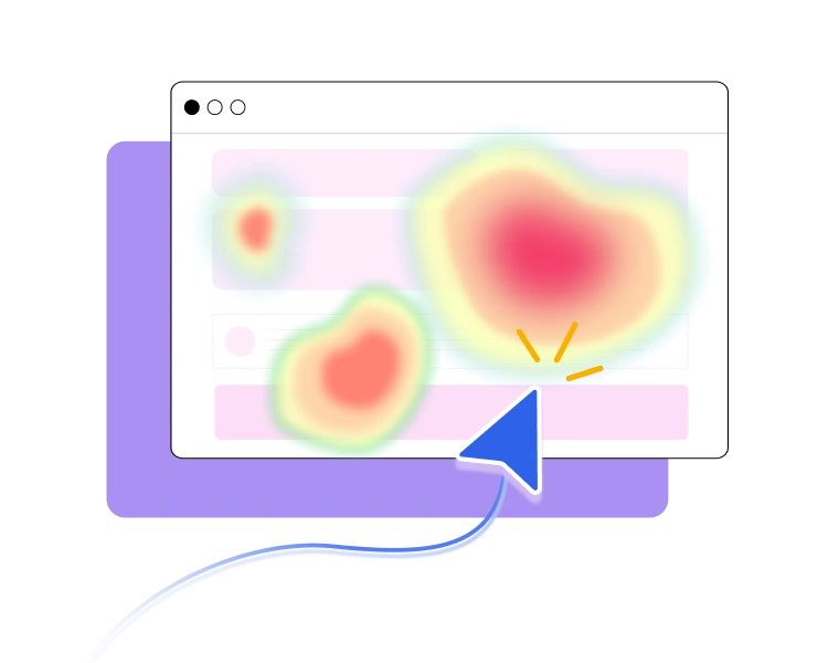
What is a Heatmap?
A heatmap visually represents how users interact with your website or app, showing clicks, scrolls, and navigation across devices to identify trends behavior.
Heatmaps simplify complex data, speeding up analysis, enhancing user experience, and boosting decision-making.
How to read: Heatmaps illustrate your content’s popular (hot) and least popular (cold) elements using a color scale from red to blue.
When to use Heatmaps?
Heatmaps are valuable tools throughout the design process. Use them in the following situations:
- Pre-design/redesign analysis: Establish a baseline for website performance and guide strategic redesign decisions.
- Post-implementation validation: Confirm the effectiveness of implemented solutions and ensure they address previously identified user issues.
- Ongoing analysis: Track the ongoing success of new features and identify areas for iterative improvement.
- Usability testing: Gain visual insights into how users interact with your website or app during usability testing sessions.
- A/B testing: Compare the performance of different design variations and determine which performs best.
- Mobile UX Analysis: Analyze user interactions on your mobile app or site to identify touch targets and responsive design issues.
Types of Heatmaps and what they reveal
Each heatmap has revealed different insights. Here are 5 heatmap examples and how to interpret them to improve your site.
Click Maps – Are users clicking where they’re supposed to?
Click maps visually reveal where users engage with videos, buttons, links, and images on a website or mobile across desktop and mobile.
Tools like UXArmy capture clicks and track the first, last, and hover actions. Analyzing the final click and hover offers insights into what users consider before exiting the site page.
With click maps, you can:
- See where users click and tap on a website or app across devices.
- Identify which CTAs are getting ignored.
- Find potential product issues and bugs.
- Visually showcase engagement data.
- Determine which on-page elements attract users the most during A/B testing.
Scroll Maps – Are users actually seeing important content?
Scroll heatmaps visually track how far users scroll down a webpage, revealing user engagement.
With scroll maps, you can:
- See how far users scroll on a page.
- Identify areas to place important content.
- Find out where you lose users’ attention.
- Discover if users see content below the average fold.
- Check your page’s cross-device experience.
- Identify user drop-off points.
Movement Maps – Where is attention naturally going?
Movement maps, or mouse-tracking heatmaps, monitor a user’s mouse movements and cursor placement, revealing areas that attract users’ attention most.
Research shows a correlation between mouse and eye movement, indicating that movement maps can effectively reflect where users look while browsing your site product.
With movement maps, you can:
- Find where you capture user attention.
- Illuminate interest in unclickable elements.
- See which elements get ignored.
Rage Click Maps – Where are users frustrated?
Rage click maps illustrate exactly where rage clicks occur on a page. They indicate usability issues (error clicks), bugs, or broken elements (dead clicks).
With rage click maps, you can:
- See where in your product users become confused and frustrated.
- Discover when users abruptly abandon the checkout.
- Pinpoint usability issues, like buttons being too small and difficult to click.
- Discover hidden or misleading elements.
Dead Clicks – What elements look clickable but aren’t?
Dead clicks reveal user frustration: instances where clicks on buttons or links yield no response.
With dead clicks, you can:
- Fix broken and disabled links.
- Catch misleading UI design.
- Identify JavaScript errors.
How to use Heatmaps to solve real UX problems
Heatmaps reveal clear patterns and trends in user behaviour for anyone selling online, including product teams, marketers, UX designers, and social media specialists.
Keep reading to learn how to use these insights in your design projects:
Content Effectiveness: Find where users ignored key message
When several elements coexist on a page, users can become distracted and lose sight of the key actions they should be taking.
We can analyze scroll, movement, and click maps to prioritize key information, identify content gaps, and enhance readability engagement.
Navigation Analysis: Identify where user struggles
Website or app users usually have specific goals, such as finding information, signing up, or purchasing. Non-functional buttons and links can lead to higher abandonment rates and frustration.
We can analyze click maps and dead maps to identify low clicks on navigation links, unusual user flows, and high exit rates from particular pages.
Pro Tip: Heatmaps from users who abandoned your funnel can reveal more than your regular satisfied users!
Call-to-Action (CTA) Performance: See which CTAs aren’t getting enough clicks
UX analytics tools like Google Analytics can highlight increased traffic and increased exit rates. However, the data doesn’t indicate whether users are having difficulty spotting the CTAs, or are simply outside our target audience.
To analyze user interactions, we can assess click, move, and dead maps. Heatmaps indicate that many users click on elements other than the CTA, suggesting a potentially confusing user interface (UI) design, such as ineffective button labelling and misleading UI.
Form Usability: Identify where users abandon forms
When users encounter complex or confusing forms, they often give up before completing them. Heatmaps reveal high clicks in specific fields and rage clicks, indicating frustration, especially on the submit button, leading to low submission rates.
Using heatmaps as visual cues reveals usability issues, allowing us to simplify form fields, clarify instructions, and improve error handling, leading to higher completion rates.
Mobile UX: Spot issues where users struggle to interact
Users often struggle with mobile elements due to small touch targets and poor design, leading to accidental taps and frustration.
Click maps and dead click maps show clustered clicks on small elements, while erratic tapping patterns can highlight mobile usability issues. These insights help us improve touch targets and mobile layouts to improve the user experience.
Common mistakes with Heatmaps and tips for optimization
Heatmaps quickly visualize user interactions on your website or app. But, it’s essential to understand how to use this data effectively to avoid wasting time.
Let’s explore common mistakes and tips for avoiding them.
Failing to set clear goals
While heatmaps can be powerful, your heatmap analysis can become aimless and unproductive without clear goals.
Do: Before exploring heatmaps, define your research objectives.
Here are some common objectives:
- Improving conversion rates.
- Determining the best location for CTA buttons.
- Identifying form fields that confuse users.
- Streamlining navigation
- Identifying UX issues in your product
Analyzing only on Click Maps
Click maps alone reveal only part of the story, and we risk overlooking vital user behaviors captured by other types of heatmaps, resulting in an incomplete understanding analysis.
Do: Evaluate click maps with scroll and movement maps to gain a holistic view. And if possible, analyze dead clicks separately.
Using Heatmap data only
Heatmaps show user actions but don’t explain why, often leaving stakeholders unconvinced. These visuals alone lack the narrative depth needed for informed decisions.
Do: Incorporate heatmap analysis alongside direct feedback to uncover the reasoning behind clicks and scrolls.
Ignoring the context of user actions
Without context, some researchers may assume that a high-click area around a non-interactive element signifies success when it might actually indicate confusion or frustration.
Do: Always ask users “Why?” and seek additional data to validate your interpretations.
Overlooking mobile heatmap data
In our mobile-first world, overlooking mobile heatmaps is a major blind spot. Users behave differently on phones and tablets than on desktops, and your heatmap data must reflect this.
Neil Patel shares that users spend 4.8 hours daily on mobile apps. So ignoring mobile could overlook essential insights into user experience on your user’s devices.
Do: Monitor device usage with analytic tools and use heatmaps to capture touch interactions and screen variations on mobile.
Tools to get started with Heatmaps
Here are 3 popular and relatively easy-to-use tools to get started with heatmaps:
UXArmy
UXArmy provides user research tools like heatmaps and clicks tests, integrating user feedback with heatmap data to clarify user behavior motivations. It emphasizes continuous feedback for ongoing optimization.
Pricing: Free plan, or premium starting from $99 / month. Request a demo, and we’ll guide you through our platform and answer your questions.
Hotjar
Hotjar (owned by ContentSquare in 2021) is a user behavior analytics tool that includes heatmaps (click, scroll, and move maps), session recordings, feedback polls, and surveys.
Pricing: Free plan, or premium starting from $50 / month.
Crazy Egg
Crazy Egg specializes in heatmaps, scrollmaps, and confetti reports (which show clicks segmented by traffic source). It’s known for its simple and clear visualizations. It’s a good option if you just want to focus on heatmap analysis,
Pricing: A 30-day free trial, or paid plan starting from $29 / month.
Enhancing your digital experience through heatmap analysis
Heatmap analysis offers a quick and simple way to understand user behavior, identify usability issues, optimize content, and improve your design for a better user experience.
Why wait any longer? Start setting up your heatmap today to enhance your website or app’s performance!
With UXArmy, you can generate free heatmaps by conducting usability or click tests to see which parts of your product customers love and hate. This will facilitate user-centric improvements for your site or app.