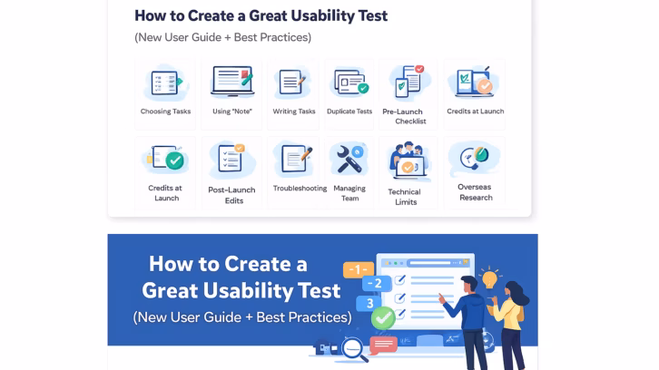
Usability testing has been a valued practice for years, and yet… we still fall into common usability testing traps.
Imagine launching a new feature only to realize—too late—that users struggle with it in ways you never anticipated. It happens, even to seasoned designers.
Usability testing serves as our design compass. It validates our work, identifies issues, and reveals user behavior and preferences. Nonetheless, senior designers can still make subtle but critical errors, such as asking leading questions and providing unconscious bias.
The good news? We can avoid these mistakes with the right approach.
Let’s explore the most common usability testing mistakes that senior designers make and how to prevent them.

1. Conducting internal user testing, without real users
Internal testing offers speed and highlights initial usability issues, but real-user testing validates solutions through real-world insights.
Recruiting the right users is essential for gathering user feedback and improving our products.
For instance, testing a mental health app requires participants who have experienced emotional challenges, such as those recovering from trauma, to ensure that the insights are both authentic and applicable.
How to avoid this mistake:
Internal testing cannot substitute for actual user testing, despite its speed. Here’s a strategic approach:
- Establish clear testing objectives: Conduct interim internal and external testing to gather early feedback. For instance, conduct a round of internal testing after prototyping, and then perform another round with real users to validate the refined design.
- Recruiting the right participants takes time. Find real users from your existing app or from services like UXArmy.
2. Vague test scenarios
Usability test scenarios bridge your product’s features and real-world user behavior.
Compelling scenarios offer actionable insights, while poorly crafted scenarios confuse participants and generate unhelpful data.
How to Avoid This Mistake:
First, let’s establish test principles scenarios:
- Scenarios should reflect common user goals and situations.
- They should prompt users to perform specific, measurable tasks.
- They should be unambiguous and easy to understand.
Let’s look into some good and bad examples:
Good Scenario (Realistic and Actionable):
“You need to change the email address linked to your account. Please update it to [new email address].” This scenario mimics a common user task with specific instructions.
Bad Scenario (Ambiguous and Impractical):
“Find the email settings.” This scenario is vague and lacks context.
I’ve got you covered. I recently wrote an article with tips and examples to inspire you to create impactful test scenarios.
3. Only running one-time testing, missing the feedback loop
Think of usability testing as perfecting a recipe. You wouldn’t expect to get it right on the first try, would you?
A single usability test is just the beginning. Iterative testing refines the design through continuous feedback, transforming a basic version into an exceptional experience.
Here’s why it matters:
- One test catches surface-level issues, but iterative testing reveals deeper user frustrations.
- Iterative testing builds team confidence by validating improvements.
- Continuous testing ensures refinements are effective, not just assumptions.
- User needs evolve—iterative testing helps your design stay relevant and user-friendly.
How to avoid this mistake:
Don’t treat usability testing as a one-time event. Commit to an iterative process that fosters continuous improvement.
4. Asking leading questions

It’s tricky to avoid leading questions. Just like journalists master neutral questioning, moderators must ask questions that won’t influence the responses.
In qualitative research, leading questions can distort results and misguide design decisions.
Let’s see some good and bad examples:
Good example:
“How did you feel about the new company policy?” This encourages the respondent to share their opinion without justifying it.
Bad example:
“Don’t you think the new company policy is unfair?” This suggests the policy is unfair, leading the respondent to agree.
How to avoid this mistake:
- Keep a concise question bank to stay on track—UXArmy even shares 40+ usability questions for actionable insights.
- Beyond testing, refine this skill in everyday conversations to make it second nature.
- Use neutral language to frame questions unbiasedly, avoiding any language suggesting a preferred answer or assumption.
- Test the questions before running tests.
- Avoid including presumptions or assumptions in the question that may influence the answer.
5. Accidental bias: The unseen influence
When we’ve invested time in a particular design direction, we may unconsciously emphasise user successes or reinforce positive interactions during testing design. This can happen because humans naturally seek information that confirms their beliefs.
Bias in usability testing can be subtle and unintentional, yet it can significantly skew results.
How to avoid this mistake:
- Standardize test scripts to ensure consistency.
- Invite multiple observers to provide diverse perspectives.
- Recruit a diverse group of participants for more balanced insights.
- Ensure the people running the test are not invested in its outcomes (and perhaps not even aware of the design decisions made).
6. Relying solely on task completion rate
Task completion rate is a valuable metric, but it doesn’t tell the full story. Just as scientists rely on multiple data points to measure progress, usability testing needs more than a single success rate to uncover deeper insights.
Here’s why multiple metrics matter:
- A high task completion rate doesn’t reveal usability struggles.
- It doesn’t indicate the time taken or effort required.
- Combining multiple metrics can expose friction points.
- Numbers provide objective support for user feedback.
Example scenario:
Imagine a task completion rate of 90% but with an average time-on-task of 5 minutes (when only 2 minutes were expected). Users shared feedback like:
- “It took a while, but I eventually found it.”
- “There were too many steps.”
- “I had to click around a lot.”
What this tells us:
- While most users completed the task, the significantly longer time-on-task and user feedback indicate inefficiency.
- Without measuring the time taken, we might assume a smooth experience. In reality, users struggled and might have abandoned the task if unobserved.
- By combining metrics, we identified a findability issue—the task was possible, but the navigation was time-consuming and frustrating.
How to Fix It:
Streamline navigation and reduce unnecessary steps to improve efficiency, ensuring successful completion and a frustration-free experience.
How to avoid this mistake:
Combine multiple UX metrics, such as time-on-task and qualitative user feedback, to ensure you fully understand how the task went.
7. Respondents forget to voice their thoughts
Even with constant reminders, users in usability testing often fall silent, focusing solely on task completion.
Understanding why users go silent helps you implement strategies for valuable feedback.
- Thinking aloud isn’t natural—many prefer reflecting and sharing thoughts later.
- Users may fear saying something “wrong” or appearing foolish.
- Many actions are automatic, making it hard to verbalize thoughts in real-time.
- Users get so focused on the task that they lack the mental energy to speak.
How to avoid this mistake:
- Set clear expectations. Reassure participants that you are testing the design, not them, and there are no “right” or “wrong” answers.
- Give them space. Allow pauses for participants to gather their thoughts instead of rushing them.
- Use open-ended prompts to encourage users to speak. Try:
- “What are you trying to accomplish here?”
- “Can you walk me through what you see on the screen?”
- “What are your thoughts as you’re doing that?”
- “What are you expecting to happen when you click that?”
- If a user comments, ask an open-ended question to encourage them to elaborate, and draw out more profound insights.
8. Skipping pilot testing

Imagine your first participant struggles with the tasks on the first day of usability testing. What would happen during the rest of the tests?
Pilot testing is your “trial run” to identify errors before they affect your data. This allows you to discover and fix.
- Unclear test instructions.
- Confusing scenarios.
- Technical difficulties.
- Timing issues.
- Any other factors that could skew your results.
How to avoid this mistake:
Always include one or two pilot tests at the beginning of your workflow, especially if you are:
- New to running usability tests.
- Testing in an unfamiliar subject area.
- Running a remote, unmoderated study.
- Testing with a new tool.
A quick pilot test can save you from major usability testing headaches—don’t skip it!
9. Intervening too soon or not intervening when needed
We often wonder: Is this the right time to step in, or should I wait?
The goal is to let users navigate independently while ensuring a smooth testing process. But striking the right balance can be tricky. Here’s how to know when to intervene—and when to hold back.
How to avoid this mistake:
- If the user is reading through the content… Give them a few more seconds to do so.
- If the user appears frustrated or confused… Acknowledge their frustration and say, “I can see you’re finding this part difficult. Let’s take a moment.” Then, pose a clarifying question: “What causes your frustration?”
- If a technical issue prevents progress… Ask them to imagine, “What are you expecting to happen when you click that?”
- If the user appears overly stressed to continue… Offer to move on to the next task.
- If the user keeps asking for an answer… Reassure them you’ll answer questions after the test.
10. Helping participants or answering their questions
When you give participants hints or answers, you disrupt their natural interaction with the interface. This creates a false sense of success, allowing users to bypass real challenges they might have faced.
As a result, the test produces misleading data and introduces bias, making it harder to identify genuine usability issues.
How to avoid this mistake:
- Stay neutral by avoiding hints.
- Use probing questions: “What would you do next?” or “What do you expect to happen?”
- Pause and let them think critically before stepping in.
- Prepare standard responses to keep sessions focused: “What do you think this button does?” or “How would you normally find this information?”
Encouraging users to complete tasks independently helps you gather more accurate usability insights and builds a stronger future product. It’s a win-win!
11. Overlooking accessibility testing: Exclusion by oversight

Accessibility isn’t optional—It’s a fundamental aspect of good design.
Accessible design allows everyone to navigate websites and apps effectively, regardless of ability. This includes people with visual, hearing, motor, and cognitive impairments.
Beyond compliance, accessibility testing improves usability and retention for those with disabilities and enhances the overall experience for all users.
How to avoid this mistake:
- Learn the basics of accessibility standards.
- Integrate accessibility early in your design and testing workflow.
- Include participants with disabilities in usability testing.
Your next step: Building better usability tests with UXArmy
Usability testing: your secret weapon for crafting truly user-centric products. However, to get actionable insights, testing must be done correctly.
Preventing common mistakes in refining testing procedures and best practices. Integrate continuous improvement into your design process. Be sure to note down any concerns that crop up during testing, so you can address them in future sessions.
Consider using UXArmy for usability testing. It allows your team to perform unmoderated usability tests and identify suitable participants. Additionally, you can take advantage of our ready-made templates to save time.
Frequently asked questions
What are common usability testing mistakes?
The most common mistakes in usability testing include using the wrong audience, neglecting mobile responsiveness, rushing the testing process, and failing to collect qualitative data
What is an example of a usability error?
For example, epressing a button that doesn’t appear to function might lead users to believe their device is malfunctioning. This lack of clarity is a common usability pitfall, making it essential to provide immediate and informative responses.
What should you never do during usability testing?
The 4 mistakes you’ll make as a usability test moderator Talking too much When moderating a usability test, you need to fight against the endency to talk too much. Explaining the design Answering questions Interviewing rather than testing How to continuously improve as a test moderator
How to identify usability issues?
How to Conduct a Usability Testing? Step1: Planning the Test. Identify the Goal of the Research. Select the Research Method. Design Your Research Questions. Step 2: Conducting Your Research Step 3: Analyzing Research Results. Transcribing Your Data. Data-Mining: Looking for Insights. Defining Themes Looking for Patterns.
How do I avoid leading questions in interviews and tests?
Use neutral, non-presumptive wording (“What do you expect would happen?” vs. “You like this, right?”). The UK Service Manual explicitly warns against leading questions.
Do I really need a epilot test?
Yes—run a short pilot to catch ambiguous tasks, tech glitches, and timing issues before launch; NN/g recommends piloting (especially for unmoderated tests).