In high-performance product teams, dashboards are the smoke detectors. They tell you that something is burning, but they rarely tell you why. For Product Managers, Growth Marketers, and Data Analysts, the challenge is knowing when data crosses a line that requires a specific research intervention.
This playbook establishes the Trigger Thresholds for 10 key metrics in GA4 and GSC metrics, mapping them to the precise UX research methods to help you figure out how to best fix them.
Pro-Tip:– The thresholds below represent industry-standard benchmarks derived from primary UX research and conversion audits. While good is relative to your specific business model, use these tripwires to transition from data monitoring to the research prescriptions outlined below.
Ready to build that trust and kickstart your research?
let’s make trust the foundation of every project you work on.

Part 1: Navigational & Structural Red Flags 
1. High Bounce Rate on Category Hubs (GA4)
The Signal: Users arrive on a major hub or category page (e.g., /solutions/, /products/, or /resources/), but they exit without clicking deeper into your site.
The Threshold: Bounce Rate > 60% for B2B/SaaS or > 45% for E-commerce. (Reference: CXL Institute Benchmarks indicate that while blog posts can have high bounce rates, Category Hubs are meant to be directories. A bounce rate exceeding 60% on a hub page is a red flag, as it means the page is acting as a dead end rather than a bridge.)
The Rationale: This signals a Secondary Navigation Failure. A hub page’s job is to help a user refine their choice If the bounce rate is high, it means the labels and categories you’ve provided don’t match the user’s Internal Taxonomy – the words they use to describe what they are looking for. Visitors have a high-level interest in your service, but they cannot find the specific door to enter the next stage of the funnel.
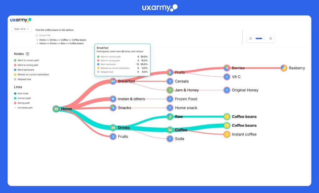
Research Prescription: Tree Testing (Information Architecture Validation).
- The Method: Use UXArmy’s Tree Testing tool. This strips away all visual design, colors, and images, leaving only the text-based hierarchy of your site.
- The Goal: Give participants a specific task, such as: Find where you would go to sign up for an Enterprise API trial.
- The Outcome: Identifies exactly where users get lost in your hierarchy so you can rename labels to match customer language..
2. High Backtracking (GA4 Path Exploration)
The Signal: In your GA4 Path Exploration report, you see users moving from Page A to Page B, then immediately back to Page A. This creates a looping pattern in your data.
The Threshold: Directness Score < 80% (or Backtracking > 20%). (Reference: Optimal Workshop IA Benchmarks define a Directness Score as the percentage of users who reach their destination without backtracking. If more than 20% of your users are retreating to the previous page, your site’s navigation labels are misleading them.)
The Rationale: This indicates Pogo-sticking caused by a False Information Scent. A user clicks a link because the label (e.g., Get Started) promised one thing, but the landing page delivered another (e.g., a Contact Sales form). When the reality of the page doesn’t match the expectation of the link, the user retreats to the previous safe point to try again.
Research Prescription: Tree Testing (Information Architecture).
- The Method: Use UXArmy’s Tree Testing to evaluate the findability of your content. Give users a task and watch how they navigate the text-only hierarchy.
- The Goal: Identify the exact branch where users are being misled. Are they clicking Support when they should be clicking Documentation?
- The Outcome: By analyzing the First Click and Success Rate data, you can refine your navigation labels so the user’s First Click is their Final Click, eliminating the inefficient pogo-sticking behavior.
3. High Internal Search Usage (GA4)
The Signal: Instead of using your primary menu or navigation bars, a high percentage of users immediately type their query into the search bar.
The Threshold: Internal Search Usage > 10% for Desktop | > 20% for Mobile. (Reference: Contentsquare 2025 Digital Experience Benchmarks indicate that while search is a shortcut for some, when the mobile hamburger menu is confusing or deep, usage spikes. If more than 1 in 5 mobile users are forced to manually type a query, your primary navigation is failing to be intuitive.)
The Rationale (The Why): This reflects the Recognition vs. Recall divide (a core Nielsen Norman Group principle). Good UX allows users to recognize their goal in a menu (low mental effort). When users resort to search, they are forced to recall the exact name of a product or service and type it correctly (high mental effort). High search usage is a SOS signal that your information architecture is invisible to the user.
Research Prescription: Card Sorting (Mental Model Alignment).
- The Method: Use UXArmy’s Card Sorting tool to ask users to organize your site’s pages into groups that make sense to them.
- The Goal: To see if users group Pricing under Product or Company, or if they use different terminology entirely (e.g., Cost instead of Fees).
- The Outcome: By aligning your site’s menu with the users’ natural mental models, you reduce the need for search, lower the interaction cost, and get users to their destination faster.
4. High Queries with Low CTR (GSC)
The Signal: Your page ranks in the Top 3 positions (highest visibility), but your Click-Through Rate (CTR) is significantly below the industry average for those spots.
The Threshold: CTR < 5.0% for Top 3 rankings. (Reference: FirstPageSage 2025 CTR Study shows that the average CTR for the Top 3 positions ranges between 10.2% and 39.8%. If your CTR is below 5.0% less than half of the lowest Top-3 average it is a statistically significant indicator of a messaging mismatch.)
The Rationale: This is a Terminology Gap. Google’s algorithm believes your content is technically relevant to the search query, which is why you are ranked highly. However, your Meta Title and Description are failing to convince the human user. You are speaking a different language than your target audience.. To fix this, you need to understand the Mental Model of Shoyour users.
Research Prescription: Open or Hybrid Card Sorting.
- The Method: Use UXArmy’s Card Sorting tool. Use Open Card Sorting to let users name their own categories, or Hybrid Card Sorting to allow them to create new labels if your existing ones don’t feel natural.
- The Goal: To capture the Natural Language of your customers. Do they call it Cloud Storage or Online Folders? Usability Testing or User Feedback?
- The Application: Use these user-generated labels to rewrite your Page Titles and Meta Descriptions. By aligning your search snippet with the user’s internal vocabulary, you improve the Information Scent from the search page, driving your CTR back toward the 10%+ benchmark.
5. High Pages per Session with Low Conversions (GA4)
The Signal: You see a segment of users visiting an unusually high number of pages (e.g., 10+), yet their conversion rate is significantly lower than the site average.
The Threshold: Pages per Session > 2x Site Average + Conversion Rate (CVR) < 1%. (Reference: Nielsen Norman Group research on Information Foraging indicates that while engagement is usually positive, an extreme number of page views combined with zero action is a primary indicator of a Navigation Loop or Discovery Failure.)
The Rationale: This behavior is a classic example of Maze Behavior driven by a weak Information Scent. According to Information Foraging Theory, users follow scents (links/labels); if the scent is faint, they wander. While this looks like high engagement, it actually represents Decision Fatigue. The user is working harder but finding less, leading to frustration and abandonment.
Research Prescription: Moderated Usability Testing
- The Method: Use UXArmy’s Moderated Usability Testing tool DeepDive® to conduct 1-on-1 sessions. Give the user a complex goal (e.g., Find the specific hardware requirements for the Enterprise plan) and ask them to Think Aloud.
- The Goal: To probe the user’s logic at the exact moment they backtrack or loop. Unlike unmoderated tests, a moderator can ask, What did you expect to find on that page? to uncover the Expectation Gap.
- The Outcome: This allows you to distinguish between genuine interest and lost behavior, identifying exactly which labels need to be moved upstream to stop the loop.
Part 2: Interaction & Conversion Red Flags
6. High Exit Rate on Multi-Step Funnels (GA4)
The Signal: A massive, disproportionate drop-off at a specific step in your conversion funnel (e.g., between Shipping and Payment).
The Threshold: Checkout abandonment > 70%. (Reference: Baymard Institute 2025/2026 research across 50+ studies shows the average documented online shopping cart abandonment rate is 70.22%. If your rate is higher than this, you are performing below the global industry average.)
The Rationale: This indicates Micro-Friction. Unlike a bounce, these users have already shown high intent by starting the checkout process. A sudden exit suggests they have hit a technical or cognitive wall that broke their momentum. Common culprits include forced account creation, unexpected costs (shipping/taxes) revealed too late, or a UI that feels insecure.
Research Prescription: Unmoderated Usability Testing.
- The Method: Use UXArmy’s Usability Testing to record users navigating the funnel in their natural environment (mobile or desktop).
- The Goal: To identify the Wall. Is a specific form field difficult to tap on mobile? Does a Sign Up button appear too aggressive? Or are users pausing and sighing when they see the final total?
- The Outcome: Recordings of the screen and verbal feedback, reactions provide the visual evidence needed to prove that a specific UI element – not just the price – is the reason for the exit.
7. Low Engagement Rate (GA4)
The Signal: Users land on your site but leave almost immediately (under 10 seconds) or fail to perform any meaningful interaction like a scroll, click, or keypress.
The Threshold: ER < 52% (B2B/SaaS) | < 60% (B2C/Ecommerce). (Reference: Databox 2025 Benchmarks show the median engagement rate for SaaS is 52.9% and Ecommerce is 60.7%. If your site falls below these medians, you are in the bottom 50% of your industry, indicating your landing page isn’t hooking the visitor.)
The Rationale: This is Information Rebuff. Within the first few seconds, the user has judged your page as irrelevant or too difficult to scan. Users either find the design untrustworthy, the headline irrelevant to their search, or the page load too slow. As noted by NN/g, users often leave a page within 10–20 seconds if the value proposition isn’t immediately clear.
Research Prescription: Time-Limited Testing + Think-Aloud Usability Test.
- The Method: Use UXArmy’s Unmoderated Usability Testing to conduct a Time-Limited or 5-Second Test followed by a Think-Aloud task which has screen and audio recording with gestures.
- The Goal: Show the page for 5 seconds and ask: What does this company sell? and Who is this for? Then, let them browse, you will learn a lot from the screen and audio recording which give you user feedback in context.
- The Outcome: You will identify exactly where users lose the scent when skimming. This allows you to rewrite headlines and move key value propositions above the fold to ensure that the user’s first impression results in an interaction rather than a retreat.
8. Mobile vs. Desktop Conversion Gap (GA4)
The Signal: Your desktop users are converting at a healthy rate, but your mobile users are dropping off at a significantly higher frequency.
The Threshold: Mobile Conversion Rate < 53% of Desktop Rate.(Reference: Contentsquare 2025 Benchmarks show that the average Desktop Conversion Rate is 3.8%, while Mobile is 2.0%. This means mobile naturally converts at about 53% of the desktop rate. If your mobile performance is significantly lower than half of your desktop performance (e.g., Desktop 4% vs. Mobile 1%), you are underperforming the industry standard, which signals a UI/UX barrier.)
The Rationale: This signals a UI/UX failure on mobile viewports. Common culprits include:
- Tapping Errors: CTA buttons are too small or too close together (violating Fitts’s Law), leading to rage clicks.
- Context Loss: Mobile screens create higher cognitive load; if users have to scroll too much to find the next step, they drop off.
- Technical Friction: Mobile keyboards obscuring input fields or slow mobile load times (a 0.1s delay can drop conversion by 8%).
Research Prescription: Mobile-Only Usability Testing.
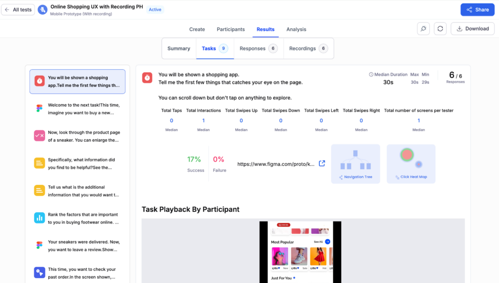
- The Method: Use UXArmy’s Unmoderated Mobile Testing to observe the thumb-friendliness of the interface in a natural environment.
- The Goal: Watch for Rage Clicks (tapping a button repeatedly because the hit target is too small) and Form Fatigue (abandoning the process because the mobile keyboard covers the input fields).
- The Outcome: Identifying these physical barriers allows you to optimize the mobile layout moving CTAs above the fold and increasing hit targets to close the gap with your desktop performance.
A Word of Caution: When testing mobile apps, prioritize Native App Usability Testing over Mobile Web (browser-based) simulations. Native testing is the only way to accurately capture platform-specific behaviors such as haptic feedback, native gestures, and OS-level interactions that are often lost or misrepresented in a standard browser test.
9. Slipping Average Position for Core Pages (GSC)
The Signal: Your ranking for a high-value primary keyword (e.g., Remote Usability Testing) shows a steady downward trend in Google Search Console.
The Threshold: A drop of 2+ positions that persists for more than 14 days. (Rationale: Search results naturally fluctuate. However, Semrush’s 2024/2025 Ranking Factor Analysis highlights that Content Quality and Relevance are now the top drivers of stability. A sustained drop of 2 or more spots typically indicates that a competitor has provided a more Helpful or Comprehensive answer, triggering Google’s algorithm to demote your page in favor of theirs.)
The Rationale: This signals Content Decay or Intent Mismatch.
- Content Decay: Your information is outdated (e.g., referencing old iOS versions) or your UX is inferior to newer competitors.
- Intent Shift: Google has realized users searching for that keyword actually want a different format (e.g., they want a Tool Comparison instead of a How-to Guide).
Research Prescription: Side-by-Side Usability Testing.
- The Method: Run a Competitive Benchmarking study. Show participants your page and a competitor’s page that is now ranking above you.
- The Goal: Perform a Preference Test followed by a Thinking Aloud task. Ask users: Which page is more helpful for [Task]? and Which tool feels more modern/trustworthy?
- The Outcome: This research tells you exactly what the competitor is doing better whether it’s a clearer layout, better terminology, or a more intuitive navigation so you can fix your UX and reclaim your ranking.
10. High Form Abandonment (GA4)
The Signal: Users are engaging with your lead-generation or sign-up forms (clicking into fields), but they are leaving the page before hitting Submit.
The Threshold: Form Abandonment Rate > 40%. (Reference: Zuko Analytics 2025 Benchmarks across 4,000+ forms show that while the average abandonment rate varies by industry, a rate exceeding 40% is the standard indicator of a high-friction form. For B2B SaaS and Professional Services, the benchmark for a good form is usually an abandonment rate of less than 33%.)
The Rationale: This is a Trust/Effort Imbalance. Every form field acts as a tax on the user’s time. High abandonment usually signals that your form is asking for too much personal information too early, or it has technical validation errors that frustrate the user.
Research Prescription: Usability Testing (Field-Level Focus). Use UXArmy to run a study where users fill out your live form while Thinking Aloud.
- The Goal: Identify the Hesitation Field. Watch for the exact moment a user stops typing, hovers their mouse indecisively, or sighs. This is your High Friction point.
- The Outcome: You’ll discover if the issue is Clarity (they don’t understand the question), Privacy (they don’t want to give you their phone number), or Technical (the Submit button isn’t working on their specific browser).
Beyond the ‘What’ to the ‘Why’ and the ‘How’
Modern product teams are drowning in the What (data) but starving for the Why (insight). While analytics dashboards act as essential smoke detectors, telling you that something is burning they rarely tell you exactly where the fire started or how to put it out. When your GA4 or GSC data hits the threshold tripwires we’ve discussed, the most expensive thing you can do is guess the solution.
Turn Red Flags into a Validated Roadmap
UXArmy provides the specialized toolkit required to bridge this gap. By matching your prescription to the right methodology – from Tree Testing for structural navigational fixes to Deep Dive® Moderated Testing for unravelling complex cognitive mazes – you ensure that every UI change is backed by the actual voice of your user.
The Full Spectrum of Insight: Beyond technical testing, UXArmy delivers the human depth needed to make your research prescriptions persuasive to stakeholders. Whether your data calls for the broad reach of Surveys, the qualitative nuance of User Interviews and Focus Groups, or the rapid validation of Unmoderated Usability Testing, you have a precise diagnostic tool for every analytics symptom.
Stop Speculating, Start Solving
By aligning your site’s architecture with your user’s mental model, you can finally move from reactive data monitoring to proactive experience design. UXArmy doesn’t just record audio, video, and screen gestures; it provides the context that transforms Search Console Queries into loyal customers.
Summary Cheat Sheet: From Analytics Red Flag to Research Prescription
Use this quick-reference guide to map your GA4 and GSC tripwires to the correct UXArmy methodology.
[The UX Diagnosis Cheat Sheet: Mapping Analytics to Action]
| Metric Issue | The Signal (Trigger Threshold) | Research Prescription |
|---|---|---|
| Category Hub Bounce | Bounce Rate > 60% (SaaS) or > 45% (Ecom) on directory/hub pages. | Tree Testing: Strips away visuals to validate if your text-based hierarchy makes sense. |
| Backtracking (Loops) | Directness Score < 80% | Tree Testing: Identifies the exact branch where navigation labels are misleading users. |
| Internal Search Usage | Usage > 10% (Desktop) or > 20% (Mobile) | Card Sorting: Aligns your site’s menu with the users’ natural mental models. |
| Low Search CTR | CTR < 5.0% for Top 3 rankings. | Open or Hybrid Card Sorting: Captures Natural Language to rewrite Meta Titles and Descriptions. |
| High Pages per Session | Pages > 2x Avg + CVR < 1% | Moderated Usability Testing: Probes the user’s logic to uncover the Expectation Gap in real-time. |
| Funnel Drop-off | Checkout abandonment > 70% | Unmoderated Usability Testing: Records users in their natural environment to see where they get stuck. |
| Low Engagement Rate | ER < 52% (SaaS) or < 60% (Ecom) | 5-Second Test + Think-Aloud: Validates if your value proposition is clear above the fold. |
| Mobile vs. Desktop Gap | Mobile CVR < 53% of Desktop CVR | Mobile-Only Usability Testing: Focuses on thumb-friendliness, rage clicks, and form fatigue. |
| SEO Rank Slip | Drop of 2+ positions for 14+ days | Side-by-Side Usability Testing: Benchmarks your page against a competitor to identify the Trust Gap. |
| Form Abandonment | Form Abandonment Rate > 40% | Usability Testing (Field-Focus): Identifies specific Hesitation Fields causing trust or effort issues. |
Experience the power of UXArmy
Join countless professionals in simplifying your user research process and delivering results that matter
Frequently asked questions
Why isn’t GA4 data enough to fix UX problems?
GA4 tells you what users are doing, but not why. Metrics like bounce rate or abandonment act as warning signals, but UX research is required to uncover the behavioral and cognitive reasons behind them.
When should I run UX research based on analytics data?
You should run UX research when key metrics cross industry benchmark thresholds such as bounce rate above 60%, checkout abandonment above 70%, or CTR below 5% for top-ranked pages.
What UX research method should I use for navigation issues?
Tree Testing and Card Sorting are ideal for navigation issues. They validate whether your site structure and labels match how users naturally think and search.
How do usability tests help reduce funnel drop-offs?
Usability tests record real user behavior, screen actions, and verbal feedback, helping teams identify micro-frictions like confusing forms, unclear CTAs, or trust-breaking moments that analytics alone can’t reveal.
Why is mobile usability testing different from desktop testing?
Mobile users face unique constraints such as thumb reach, small hit targets, keyboards blocking fields, and slower load times. Native mobile usability testing is essential to capture these real-world behaviors accurately.
What causes high pages per session but low conversions?
This often indicates maze behavior, where users are lost rather than engaged. It signals weak information scent and requires moderated usability testing to understand user intent and expectations.
How does UX research help improve SEO performance?
UX research uncovers terminology gaps, intent mismatches, and trust issues that affect CTR and rankings. Aligning content with user mental models improves both engagement and search visibility.
What is the benefit of mapping analytics to UX research methods?
It removes guesswork. Instead of redesigning based on assumptions, teams apply the right UX method to the right problem, saving time, reducing risk, and increasing conversion impact.

