That’s just the warm-up.
Getting real users to test your design is a great start, but what happens next? Raw test results won’t magically turn into insights. If you don’t analyse usability test results and present them well, stakeholders might shrug and move on, leaving your hard work unnoticed.
Proper analysis helps identify usability issues, prioritize fixes, and enhance the overall user experience.
The real power of usability testing lies in how you interpret the data and turn findings into action. Done right, your analysis can help you:
- Uncover usability issues before they snowball into bigger problems
- Convince stakeholders why something needs fixing (without endless debates)
- Improve user experience and, ultimately, business success
So, how do you make sense of all the feedback and numbers? Let’s break it down.
Why analysis matters
To get a holistic view, it is essential to evaluate both quantitative and qualitative results and present a combined picture.
- Quantitative data (e.g., task success rates, time on task, error rates) provides measurable insights and helps benchmark usability.
- Qualitative data (e.g., user comments, pain points, behavioral observations) reveals the underlying reasons behind usability issues.
While quantitative metrics offer a structured way to gauge usability, they often lack context. A usability test typically involves a small sample size, which may not be sufficient to convince stakeholders about the findings. Supporting quantitative data with qualitative insights ensures a richer understanding of user behavior.
Numbers tell you what’s happening, but without context, they’re just… numbers.
For example, a low task success rate alone does not indicate why users are failing; it could be due to unclear instructions, confusing UI elements, or technical issues. Qualitative data helps bridge this gap, providing the ‘why’ behind the numbers and making usability findings more actionable.
Merging these two perspectives ensures that we don’t just see what is happening but also why it’s happening, leading to actionable recommendations.
Step-by-step guide to analyzing usability test results
Analyzing usability test results doesn’t have to feel overwhelming. With a structured approach, you can turn raw data into clear, actionable insights that drive meaningful design improvements.
1. Organize your data
After conducting usability tests, you may have a mix of notes, recordings and survey responses. To prevent information overload, structure your data efficiently. Start by reviewing all test sessions and categorizing observations into common themes such as navigation issues, unclear instructions, or design inconsistencies.
Focus on both individual and aggregate results. A structured approach helps in comparing user behaviors, identifying recurring problems, and drawing conclusions with clarity.
A structured table helps consolidate information in a digestible format. Maybe something like this would work:
| Metric | Description | Example |
|---|---|---|
| Task Completion Rate | (No. of successful users / total users) * 100% | 75% of users completed checkout successfully |
| Time on Task | Average time users took to complete a task | Checkout process took 90 sec on average |
| SUS Score (System Usability Scale) | Standardized usability score (0-100) | SUS score of 68 indicates usability issues |
| CSET (Customer Satisfaction Evaluation Tool) | User satisfaction rating | 3.5/5 indicating moderate satisfaction |
2. Identify patterns in user behavior
Analyzing usability test results is more than just crunching numbers it’s about recognizing behavioral patterns and pain points. Look for repeated user behaviors such as hesitation, confusion, or incorrect clicks.
Some key questions to ask:
- Did users struggle with similar elements (e.g., button placement, form fields)?
- Were there points of significant delay or drop-off?
- Did users express confusion about specific terminology?
To make sense of these patterns, use affinity mapping techniques. Start by reviewing user feedback and session recordings, then group similar observations into categories such as navigation issues, UI confusion, or content clarity problems.
This method helps visualize recurring problems, making it easier to spot trends and prioritize fixes. Additionally, consider using digital tools like Miro or FigJam to create a collaborative affinity map that stakeholders can interact with.
One of the most valuable aspects of usability testing is gathering direct user feedback and observational insights. When reviewing test sessions, take structured notes of:
- Key observations: Any notable issues users encounter, such as difficulty finding a button or confusion over a form field.
- User behaviors: Hesitation, frequent backtracking, or repeated errors.
- Verbatim quotes: Direct statements from users expressing frustration, confusion, or satisfaction. These can be categorized into themes like navigation, UI clarity, or content issues.
For example:
| Category | Observation | Quote |
|---|---|---|
| Navigation Issue | Users struggled to find the cart button | “Where is the cart? I can’t see it.” |
| UI Confusion | The checkout button was too small | “I almost missed the checkout button.” |
| Content Clarity | Product descriptions were vague | “I wish there was more detail about the materials.” |
These notes help in identifying patterns across multiple users and provide qualitative depth to the quantitative findings.
3. Prioritize usability issues
Not all usability issues are equally significant. Use a severity scale to categorize problems:
- Critical (High Impact): Prevents users from completing key tasks. (e.g., login failures)
- Serious (Medium Impact): Causes frustration but doesn’t block task completion. (e.g., unclear form validation)
- Minor (Low Impact): Small inconveniences that affect usability but don’t disrupt workflow. (e.g., unclear button labels)
When prioritizing, consider:
- Frequency: How often does the issue occur?
- Impact: How much does it affect user experience?
- Effort to fix: How complex is the solution?
4. Visualize your findings
Numbers and raw data are great, but let’s be honest nobody wants to dig through a dense report.
Presenting usability test results visually makes insights easier to digest and far more impactful for stakeholders. Instead of wading through walls of text, decision-makers can quickly spot trends, problem areas, and opportunities for improvement at a glance.
So, how do you turn your findings into something stakeholders actually want to look at? Here are a few go-to methods:
- Heatmaps: One of the most effective ways to visualize usability data is through heatmaps, which illustrate where users interact most and where they struggle. For example, if a heatmap shows minimal interaction with a call-to-action button, it suggests that users may not be noticing it.
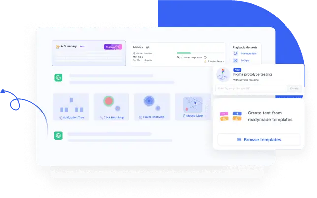
- User flow diagrams: Another essential visualization tool is user flow diagrams, which help track how users navigate a product and where they drop off. These diagrams can highlight bottlenecks in processes like onboarding, checkout, or form submissions, making it easier to pinpoint areas that require improvement. UXArmy unmoderated test reports help you generate Heatmaps and navigation tree to make data analysis easier and also visually enhance the test report.
- Bar charts & comparisons: Additionally, using bar charts to compare success rates across different tasks can provide a clear, at-a-glance view of usability performance. For instance, if 90% of users successfully completed a login task but only 50% managed to find the settings page, this signals a navigation issue that needs attention.
By incorporating these visualization techniques, usability findings become more actionable and accessible, making it easier to advocate for necessary design changes.
Mistakes to avoid when analyzing results
Even the best usability tests can go to waste if the analysis isn’t done right. Think of it this way your data is only as useful as the insights you pull from it.
Let’s look at some common mistakes that can turn valuable research into missed opportunities:
- Overlooking Qualitative Insights: Focusing only on numbers without considering user feedback can lead to misinterpretations. Quantitative data shows what happened, but asking the right qualitative questions reveal why it happened. Always analyze why issues occurred to get a full picture.
- Not Prioritizing Issues: Treating all problems as equally important can slow down decision-making. Use a severity scale to guide prioritization so that the most critical usability problems are addressed first.
- Ignoring Outliers: Outliers refer to unusual test results or behaviors that don’t fit the general pattern. While it may be tempting to ignore them, they can indicate overlooked usability flaws. Investigate outliers to see if they point to an underlying issue that needs attention.
- Presenting Data Without Context: Simply listing numbers without explanation won’t be compelling. Always provide context, real user examples, and explanations to make the data actionable for stakeholders.
- Failing to Make Actionable Recommendations: Stakeholders need clear next steps. Ensure your report includes concrete suggestions for improvement, linking each problem to a proposed solution to drive meaningful changes.
How to create an engaging usability testing report
A usability testing report isn’t just a data dump it’s your chance to tell a compelling story about how real users experience your product. The goal? Make it so engaging that stakeholders can’t ignore the insights.
1. Start with a Summary
Provide a concise executive summary that highlights:
- Main findings (e.g., “Users struggled most with the checkout process.”)
- Key metrics (e.g., “Task completion rate for checkout was 75%.”)
- Recommended improvements (e.g., “Revise payment options layout.”)
2. Use Storytelling Techniques
Numbers alone don’t tell the full story. Include user quotes to add a human element:
“I wasn’t sure which button to press at checkout it was confusing!”.
Real user voices make insights more relatable and persuasive.
3. Provide Clear Recommendations
Don’t just highlight problems rather offer solutions:
- If users struggle with a checkout button label, suggest renaming it to be clearer (e.g., “Pay Now” instead of “Proceed”).
- If form fields cause confusion, reduce unnecessary inputs and provide inline validation.
4. Keep It Visual and Interactive
Instead of a text-heavy document, incorporate:
- Screenshots with annotations
- GIFs or short videos of usability issues
A usability testing report should be clear, concise, and convincing not something that collects dust in a shared folder. By combining storytelling, visuals, and actionable recommendations, you can transform usability findings into a roadmap for better user experiences. After all, what’s the point of testing if the insights don’t lead to real improvements?
Conclusion
- As user researchers, it is crucial to have empathy for our non-research colleagues, such as developers, and product managers, who rely on our findings to make informed decisions.
- Conducting usability tests and gathering data is just one part of the process; the real challenge lies in presenting the insights in a way that is clear, engaging, and actionable.
- If research findings are not structured well and communicated effectively, they risk being misunderstood or overlooked, reducing their impact on product decisions.
- The responsibility of ensuring that usability test results are meaningful and accessible falls on us. We can bridge the gap between research insights and practical implementation by crafting well-organized reports, using visual storytelling techniques, and providing actionable recommendations.
- When teams understand and recognize the value of our research, usability testing becomes a key driver of product success, ultimately leading to a better user experience for all.
- That’s where UXArmy can help. From conducting usability tests to turning raw data into structured, actionable insights, our platform makes research easier, faster, and more impactful. Sign up for free and see how UXArmy can transform your research into results.
Frequently asked questions
How do I analyze usability test results without getting overwhelmed?
Start by structuring data (tasks, metrics, notes, quotes), run affinity diagramming to cluster themes, then prioritize with a severity scale before drafting recommendations.
What’s the best mix of quantitative and qualitative data?
Use task success/time/errors + SUS for comparables and verbatim quotes/observations for the “why.” Pair online usability testing metrics with recordings and user surveys for depth.
How many participants are enough for usability testing?
For qualitative testing, 5-8 participants often expose the majority of usability issues (per Nielsen Norman Group’s classic research). For quantitative benchmarking, plan around 20+ participants to get statistically reliable metrics.
How do I prioritize issues from user testing?
Apply a severity rating (impact × frequency × fix effort). Use simple High/Medium/Low or a 0–4/5 scale so stakeholders know what to fix first.
What is the System Usability Scale (SUS) and how do I use it?
SUS is a 10-item survey yielding a score out of 100. A score of 68 is considered the average benchmark, so anything above that indicates above-average usability. Use a SUS score calculator to standardize scoring across your team.
Which visuals make my usability report persuasive?
Combine heatmaps, user flows, bar charts, and short clips. Many user testing platforms auto-generate heatmaps and navigation trees to speed analysis.