
Know your design works even before it becomes a dev ticket.
Real user feedback at the wireframe, prototype, and live stage. So you walk into every design review with evidence, not assumptions.
Trusted by product teams at











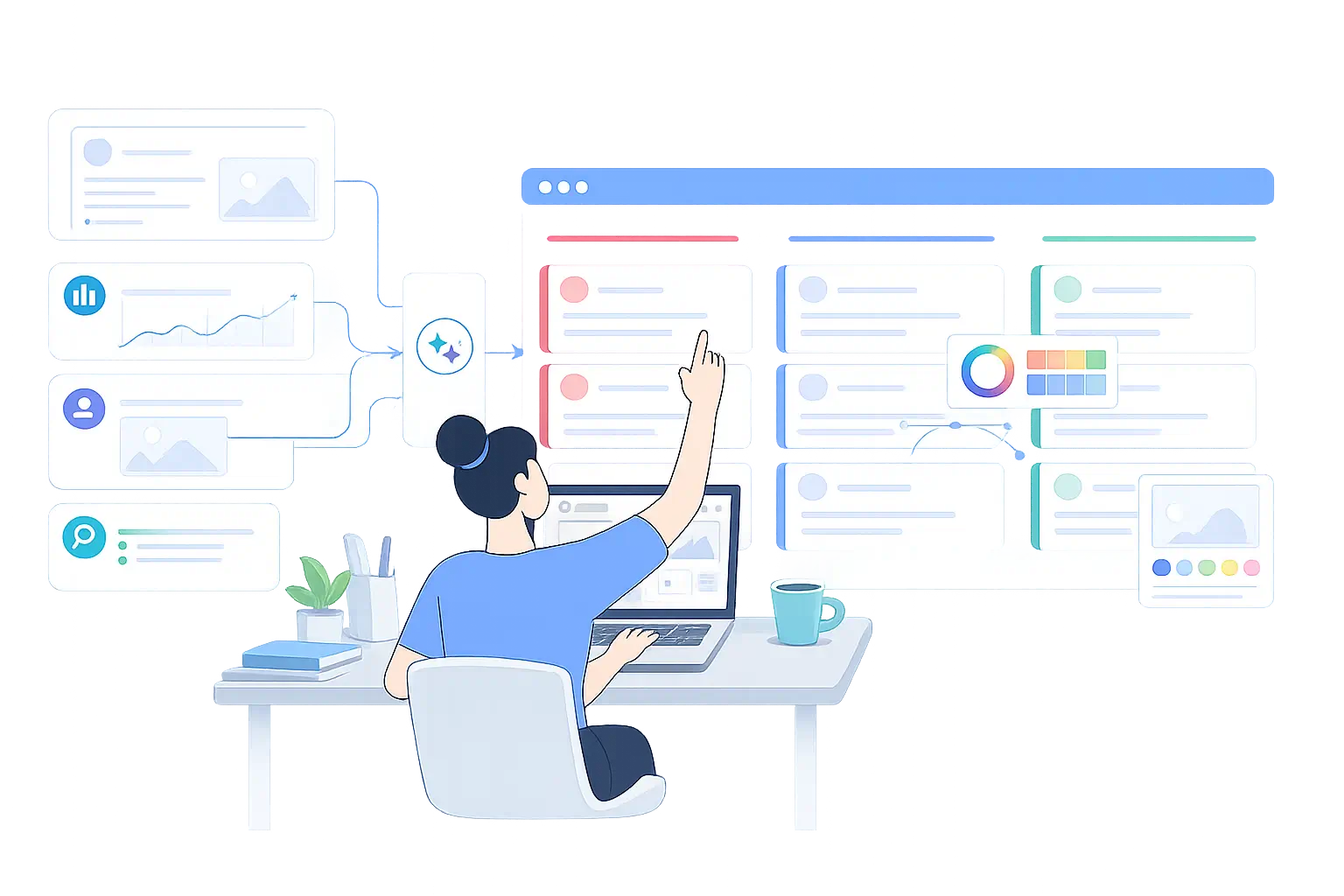
Design with evidence. Not with fingers crossed.
You know your flows. You know your components. What you don’t know until it’s too late is whether the screen that looked right in review is the one that gets people stuck. The designers who ship consistently well test before the handoff. Not after something breaks. UXArmy makes that easy enough to actually do.
Test your designs. Not your luck.
Usability testing, prototype testing, tree testing results in days, not weeks. So the next design review starts with evidence, not a disclaimer.
Four questions every product designer needs answered before handoff.
Every design decision has stakes you can’t settle with taste alone.
Decision 1: Is this design direction even worth pursuing?
Every design review has two or three directions on the table. The one that ships is usually the one someone argued loudest for — not the one users actually preferred. Picking a direction on taste alone means finding out you picked wrong after detailed design work has already started.
Put your direction options in front of real users before you commit. Find out which is clearer, more trustworthy, and easier to understand and why. Walk into the review with a result, not a personal opinion.
What you get:
- Ranked preference scores across design directions.
- The reasoning behind the numbers, in users' own words.
- A decision you can defend in review even before detailed design work starts.
Decision 2: Will people actually be able to use this?
A screen can look polished in Figma and still fail in the hands of a first-time user. They can't find the button, don't understand the label, or give up halfway through the flow. Usability problems are cheap to fix in a prototype. They're expensive to fix after dev handoff.
Test your Figma, HTML, Marvel or Sketch prototype directly. No build required. Screen recordings, task completion rates, and AI-summarised reports show exactly where users struggle. Test before handoff. Re-test after each revision to confirm the fix actually worked.
What you get:
- Task completion and time-on-task data.
- Screen recordings and heatmaps showing exactly where users struggle.
- AI-generated summaries so you don't have to watch every session.
Decision 3: Does the structure actually make sense to users?
You organised the nav, the menu, and the content structure the way it made sense to your team. After months of living inside the product. That's exactly the perspective a first-time user doesn't have. Structures that feel obvious internally are one of the most common sources of confusion post-launch.
Card sorting shows how users naturally group your content. Tree testing confirms whether your structure holds up when someone has to find something in it. Both run before the structure is locked into navigation while it's still cheap to change.
What you get:
- A clear picture of how users mentally organize your product.
- Evidence for an IA decision before it's built into navigation.
- A structure validated by users, not just by your team.
Decision 4: Did the redesign actually improve things?
You shipped the redesign. It looks better. But looks better isn't a metric and nearly every failed redesign looked fine in the design review right up until users started struggling with it in production.
Test each version as the design evolves. Compare task success, completion time, and friction points release over release. Confirm that an iteration actually moved the product forward instead of just changing how it looks.
What you get:
- Version-over-version task success and completion-time comparisons.
- Screen recordings showing real behaviour, not just a before/after screenshot.
- Confirmation that a redesign is an improvement, not just a change.
Validate Like A Pro(duct) Designer. Even When You're a Team of One.
Most designers don’t have a researcher to lean on. That shouldn’t be why a screen ships unvalidated. Traditional research assumes a dedicated researcher, a multi-week cycle, and a handoff date that can wait. Most design teams have none of that and shouldn’t need it just to find out if a flow works before it goes to development.
Self-serve or fully managed your choice
Run it yourself using platform templates, AI-assisted reporting, and built-in participant recruitment. No researcher needed. Or brief UXArmy’s research team and get a complete study back, from screener to report, without touching the setup. Either way, the findings land in a format you can take straight into review.
Local-language testing globally
Feedback in French, Spanish, Japanese, Thai, Arabic, Turkish, and more. If you’re designing for users who don’t think in English, validating only in English isn’t testing. It’s assuming. For designers working across markets, local-language testing isn’t optional. It’s the difference between findings you can trust and findings that only tell half the story.
Findings while the design is still in Figma
Most usability and preference tests return results within 24 to 48 hours. That’s fast enough to validate before handoff, re-test after a revision, and still hit the sprint deadline. Not fast enough to read after dev has already built the thing you should have tested last week.
Questions product designers ask before they run their first study.
Here are answers to common questions you might have.
Can I test a Figma prototype without exporting or building anything?
Yes. UXArmy tests Figma prototypes directly in the browser, no downloads or installs, while still capturing heatmaps, navigation paths, and usability metrics.
How is this different from a design review?
A design review captures opinions from people who already understand the product. UXArmy captures behavior from people encountering it for the first time, a much closer proxy for real users.
Can I test a single screen, or does it need to be a full product?
A single screen or flow works well. Most designer-led studies validate one specific decision, not an entire product end to end.
How many participants do I need?
5 to 8 per user segment is typically enough to surface the major usability issues before dev handoff.
Does UXArmy work with Adobe XD and Sketch, or only Figma?
It supports Figma, Adobe XD, Sketch, and other common design tools.
How do I bring results to a non-design stakeholder?
Recordings, heatmaps, and AI summaries can be shared directly, so stakeholders see the evidence, not a secondhand summary.
Can I compare two design directions against each other?
Yes. Running the same tasks against two prototype variants and comparing task success and heatmap behavior is a common way to settle a design debate with evidence.
Have more questions?
If you have any other questions that are not covered here, please don’t hesitate to reach out. We’re here to provide the information you need and ensure your experience with us is smooth and enjoyable.
Tell us the product decision you're trying to make.
You don’t need a research brief. Just tell us what you’re trying to find out which decision, which users, and roughly when you need it. Our team will recommend the right study and come back within one business day.
Start Designing with Evidence, Not Assumptions
Test your next prototype, screen, or flow with real users. No credit card required.
