Your team redesigns a key screen. Users say they loved it in testing. Conversions drop the week you ship it. Behavioral UX is what catches that gap before it costs you. Research from the UX Design Institute shows 88% of users won’t return after a single bad experience, so every decision point in your product is one you cannot afford to guess on. This guide uses user behavior data to show you what to look for and what to fix.
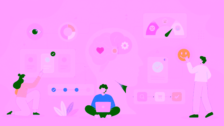
Behavioral UX is the practice of designing digital products around how users actually make decisions, not how you assume they will. It applies psychology and behavioral economics to find where users hesitate, pick the wrong option, or leave before completing a task. The result is fewer drop-offs, better decision-making at every step, and products that work with how people actually think.
Key Takeaways
- Behavioral UX closes the gap between what users say they will do and what they actually do inside your product.
- Behavioral design UX uses principles like loss aversion, anchoring, and default bias to cut friction at real decision points.
- UX behavior captured through session recordings and heatmaps shows patterns that post-session surveys miss every time.
- Cognitive biases are not obstacles. In UX behavioral design, they tell you exactly where users need help deciding.
- Forrester Consulting’s August 2025 Total Economic Impact study found teams running continuous behavioral UX testing achieve up to 10.8% higher revenue retention over three years.
How Is Behavioral UX Different From Traditional UX?
Unlike traditional UX, which checks whether a user can complete a task, behavioral design UX asks why they hesitate, take the wrong path, or quit before they finish. One question checks capability. The other finds where your product is actually losing people.
| Dimension | Traditional UX | Behavioral UX |
| Core question | Can the user complete this task? | Why do users hesitate or decide incorrectly? |
| Data source | Surveys and self-reported feedback | Session recordings, heatmaps, task success rates |
| Core assumption | Users behave as they say they will | Users rely on mental shortcuts, not careful logic |
| Biggest risk | Designing for stated intent, not real actions | Missing where design pushes users toward wrong choices |
| Primary outcome | Task completion and satisfaction scores | Lower drop-off at every decision point |
Nielsen Norman Group’s research confirms this. Attitudinal data and behavioral data regularly tell opposite stories. What users say in a survey and what they actually do inside your product are often two completely different things.
How Do Cognitive Biases Drive User Decisions?
Cognitive biases are the mental shortcuts users rely on when making decisions inside your product, and they activate before any conscious evaluation begins. Evaluating every option from scratch takes too much effort, so the brain skips it. Your product is already triggering these patterns, whether you designed for them or not.
In behavioral design UX, these patterns are not something to work around. They are the clearest signal you have for where your interface is helping users and where it is losing them.
| Cognitive Bias | What It Does | Real UX Example |
| Loss aversion | Users fear losing something more than they value gaining the same thing | “Cancel anytime” on a free trial converts better than “Sign up now” because it removes the fear of commitment |
| Anchoring | The first number a user sees becomes their reference for everything after | Showing your highest plan first makes the mid-tier feel like the smart, reasonable pick |
| Default bias | Users stick with preset choices far more than active thinking would suggest | A pre-selected recommended plan cuts decision fatigue without removing control from the user |
| Social proof | When uncertain, users copy what others have already done | A live user count or a “most popular” label tells users which option is safe without making them think it through |
These four biases are already active on your pricing page, your checkout, and your onboarding right now. You either designed for them intentionally, or you left them working against you.
How Do You Test Whether Your Behavioral UX Is Working?
Most teams rely on post-session surveys. The problem is that surveys capture opinions, not decisions. A user can rate your checkout as simple and still abandon it at the payment step. Both things can be true at the same time. The gap between what users say and what they do is exactly where your drop-offs live.
The only way to see real UX behavior is to watch it happen. These user research methods show you what actually happens, not what users thought happened afterward.
Session Recordings
Watch real users complete specific tasks without a moderator in the room. You see where they pause, click the wrong element, or abandon a flow entirely. No survey gets close to that. You are watching someone use your product in their own space, with no one asking them to explain themselves. The moments where they hesitate, backtrack, or quietly give up are the ones that tell you the most.
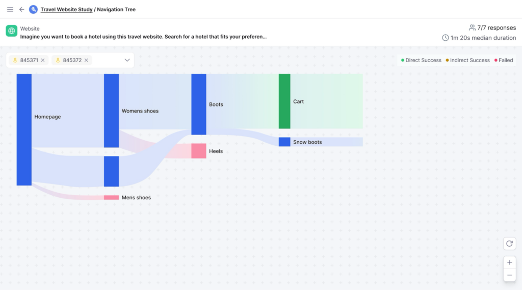
Heatmaps and Click Path Analysis
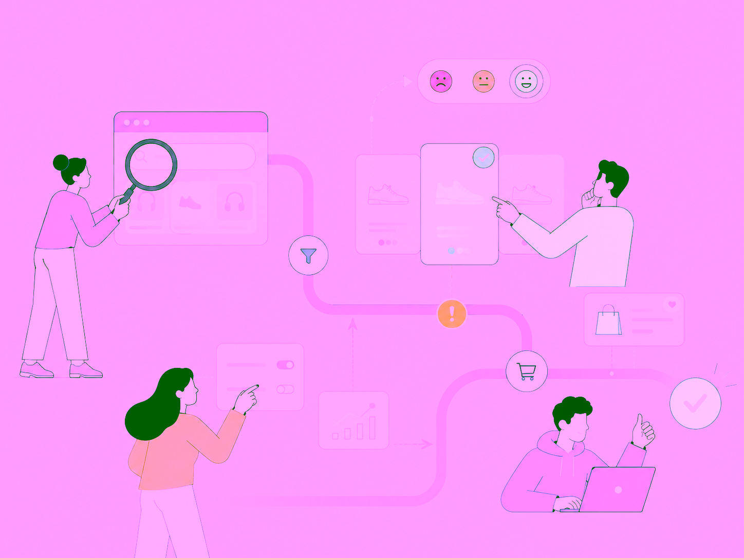
See where attention lands across a page. Your primary call to action might sit in a strong visual spot and still get ignored. A heatmap shows you that in seconds.
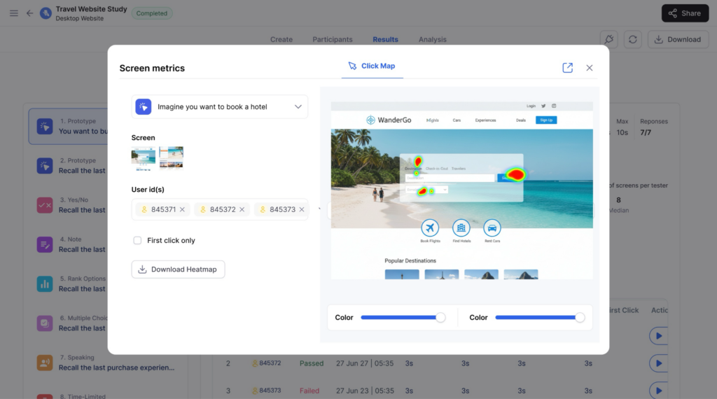
Click path data tells you where users went instead. Sometimes it is a link in your footer. Sometimes it is a button you considered removing three sprints ago.
Task Success Rate Tracking
Set a clear completion point for a key user journey and measure what percentage of users reach it. Track how many steps it takes them to get there.
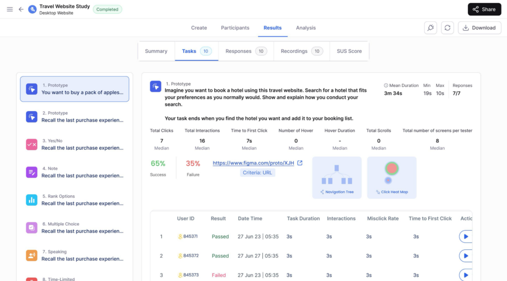
A low success rate on a task that users called simple in a survey is one of the most consistent findings in behavioral UX research. Teams expect to find problems in complex flows. They rarely expect to find them on the ones users said were easy. Before you move a single button or rewrite a headline, analyze your usability test results from real, recorded sessions first.
What Do You Do With Behavioral UX Data After You Collect It?
Collecting behavioral data is the easy part. Most teams watch the recordings, flag ten issues, and then spend weeks deciding what to fix first.
Start with the task success rate by journey. Rank every key flow by failure rate and fix the highest drop-off first, not the one your team finds most interesting. Three or more users hitting the same friction point in the same place is a pattern worth acting on. One user doing it is an anomaly.
Separate navigation failures from comprehension failures. Users who cannot find something need a layout fix. Users who find it but do not understand it need a copy fix. Treating both the same way wastes sprints.
After every significant change, retest. UX behavior shifts as your product grows. A fix that works today may create new friction six months later when new features add complexity.
How Does UXArmy Help You Test Behavioral UX?
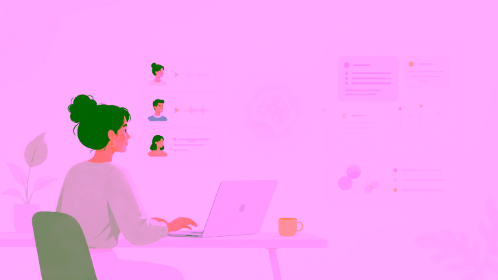
UXArmy gives you screen recordings, heatmaps, navigation paths, click data, and AI sentiment summaries across 25+ languages, all in one platform. Founded in Singapore in 2012 and certified to SOC 2 Type 2, ISO 27001, GDPR, and HIPAA, your research data stays protected while you work with no extra security setup on your end. Product teams globally trust it to run behavioral research at scale. Start your first unmoderated usability testing session and see what your users are actually deciding at every step.
Conclusion
Most product decisions get made on survey data. Real behavioral UX gets built on what users do when no one is asking questions.
If your team had to choose right now between a hundred survey responses and ten recorded sessions, which one would actually show you where users are dropping off?
Start with one recorded session for your highest-drop-off journey. Most teams find more to fix in that first hour of recordings than in months of survey data. UXArmy’s platform makes that first session straightforward to set up.
Run Your First Behavioral UX Test Today
Surveys show you opinions. UXArmy shows you decisions. Screen recordings, heatmaps, task success data, and AI-powered summaries across 25+ languages, all in one platform. Sign up free or book a demo and see what your users actually do for the first time.
FAQs on Behavioral UX
What is the difference between behavioral UX and traditional UX design?
Traditional UX tells you a user couldn’t find the checkout button. Behavioral UX shows you they found it, hovered over it for four seconds, and left anyway. One gives you a completion rate. The other gives you a reason. That difference is where better design decisions come from.
How do cognitive biases shape decisions inside digital products?
Most users have already started deciding before they consciously read a word of your copy. Anchoring, loss aversion, social proof, and default bias all activate before a user weighs any options. Behavioral design UX maps those patterns at each decision point so you can design with how users think rather than against it.
What is behavioral design UX and how do product teams use it?
Behavioral design UX is applying behavioral economics to product design decisions. Teams find which biases are active at key moments in a user journey, then adjust copy, layout, and defaults to lower friction at exactly those points. Observed behavior validates it, not what users say they prefer in a survey.
How do you measure UX behavior during usability testing?
You measure UX behavior through task success rate, time on task, number of clicks to completion, and where users leave your intended path. These come from unmoderated sessions with screen and voice recording. A user who calls a task easy but takes five wrong turns in the recording is your most useful data point of the entire test.
Why does UX behavioral design outperform preference testing on conversion?
Users predict their own behavior poorly. They respond to anchors, defaults, and social signals before making any conscious choice. UX behavioral design built on real decision data beats preference surveys on conversion, task completion, and retention. The teams that figure this out early stop arguing about button colors and start watching what users actually do.