


What to test at each stage, which tool fits the job, and what good looks like when you get it right.
“Build fast, fail fast” gets repeated in every accelerator, every pitch deck, every founder group chat. It’s good advice for engineering speed – shipping quickly really is an advantage. But speed only pays off if each release teaches you something. Without a way to test (or validate) what you’re building, ten fast iterations can just be the same wrong guess wearing a slightly different interface each time you ship. That’s not iteration, it’s busywork. And it quietly buries you and your startup deeper in tech and design debt.
Startups are extremely resource-constrained, so the margin for error is unforgivingly small. A mistake in the product can force a pivot, or kill the idea altogether. Failure is celebrated in the entrepreneurship world for good reason but it’s never a founder’s goal. A startup is a very different environment from the “calculated-risk,” almost-blind bets that large corporations in traditional industries e.g. financial services, telcos, etc. can afford to take.
“You are not the user” is a famous mantra, and it hits hard. After all, no startup ever set out to build a product only for its founders. So your future users, or the people closest to them, should get their hands on your product before you write a single line of code. In a startup’s earliest stages, the founder needs a way to check whether the idea, the concept, or that very first rough prototype actually resonates with the people it’s meant for.
Throughout this piece, I’ve resisted the temptation to use the word “research,” because it may sound like a traditional, slow and expensive exercise in this AI era. Speed is one of the most critical factors in the startup game, and I’m well aware of that. What follows is my list of ways to validate with users as scrappily as possible, without any compromise on speed. None of these recommendations should slow a founder down. Instead, each one should give you a chance to course-correct while only a small amount of development effort has gone into something that turns out not to be useful.
This guide follows the actual shape of a startup’s first year: idea, sketch, prototype, live-but-small, live-to-everyone. At each stage, you’ll find what I’ve seen founders do, what tends to work better, which tools fit the job and why, how to get started, and what a good result actually looks like. I’ve tried to keep the research jargon out of it.
Stage 1: An idea or Concept
Most founders start by talking to people who already like them: a co-founder’s partner, a friend from university, someone encouraging in a Slack group. It feels like user research. It behaves like a pep talk. People who already root for you are structurally incapable of giving you a cold, honest first reaction, and “yeah, I’d probably use that” over coffee costs the other person nothing. That’s why you can’t really trust that line of thinking.
What tends to work instead is a short run of open conversations with people who plausibly have the problem and not people who have you. Aim for seven or eight calls (there’s no golden number, trust me!), twenty to thirty minutes each. Ask what their week actually looks like around this problem, and how they currently solve or work around it. Hold back your own pitch, no matter how tempting it is. If you find yourself describing your product more than they’re describing their problem, that’s the moment to catch yourself, pause, and ask a different question.
Collect all that information to understand the product perspectives and if the expectations meet your market (user) needs.
- Speak for the problem you are solving. “Single employed young professionals who invest in crypto and stocks every month” beats “Malaysians and Indians aged 25 – 34,” because the first tells you they may have the problem you’re solving for.
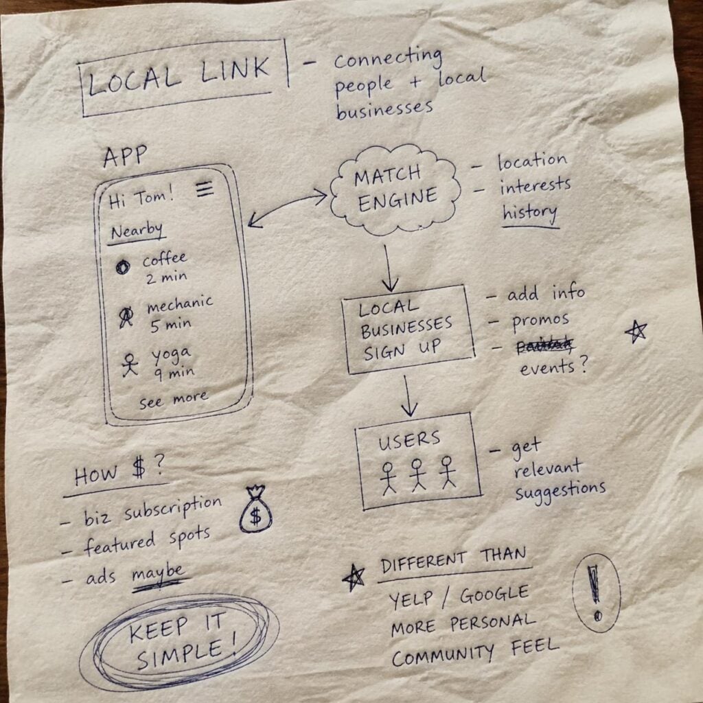
- Sketch as you go, show them yours. A rough drawing of the idea costs nothing, sharpens your own thinking, and gives you something concrete to react to once people start describing the problem in their own words.
- Write down ‘everything’ that you hear. Don’t depend upon AI summary from meeting software or your fancy note-taking tool. A transcribed recording (corrected by manual editing) of your conversation copied to a shared spreadsheet with one column per call will work best. Patterns only become visible once several calls sit next to each other.
That spreadsheet is your “data” and will help sharpen your strategy. Use that to refine your idea and fill the gaps in your problem formulation and solution. The user inputs will surprise you.
Which tools to use, and how: your own notebook, calendar and any free video call software like ZOOM should be enough to start. The one place founders get stuck is finding ten strangers who actually match the problem. Your own network runs out fast, everyone replies busy and it’s biased toward people who already like you.
Unless you are a networking Ninja, you almost certainly are going to face problems in finding the people to talk to. People avoid strangers, for a fact! Everyone is busy. Recruitment panels are not an option. Even the costs of UXArmy’s own user panel do not allow usage with shoestring budgets that startups need to work with. A participant recruitment panel is a non-option.
Time to carve out the Salesman inside the Founder 🙂 Be ready for getting declined and even ghosting.
Start this week: list eight people who plausibly have the problem. Not friends. Message five of them today asking for fifteen minutes.
What to expect: not yet certainty, but a pattern in responses would emerge. The same frustration showing up, unprompted, across several unrelated calls is a real signal. One or two enthusiastic reaction is not.
You may also run a online survey at the idea stage in case you are finalising your brand name, brand colours and logo. For that you can use any free survey tool but if you feel constrained due to their features inaccessible due to paywalls, UXArmy free plan should be suitable for you.
Stage 2: Idea as a simple navigable wireframe
Moving on from the idea phase, this is when founders decide the scope and structure of the product (or at least its first launch version). The common move, and the temptation, is to jump straight from a rough idea into a polished Figma file, or worse, straight into code, because a bare-bones wireframe feels like “not real work yet” and founders can’t wait to build their shiny new product.
The cost of rushing this stage shows up later: menus, categories, and navigation get organized around how the founding team thinks about the product internally, which is rarely how a user thinks about it in real life. And that’s before you even get to real-life edge cases.
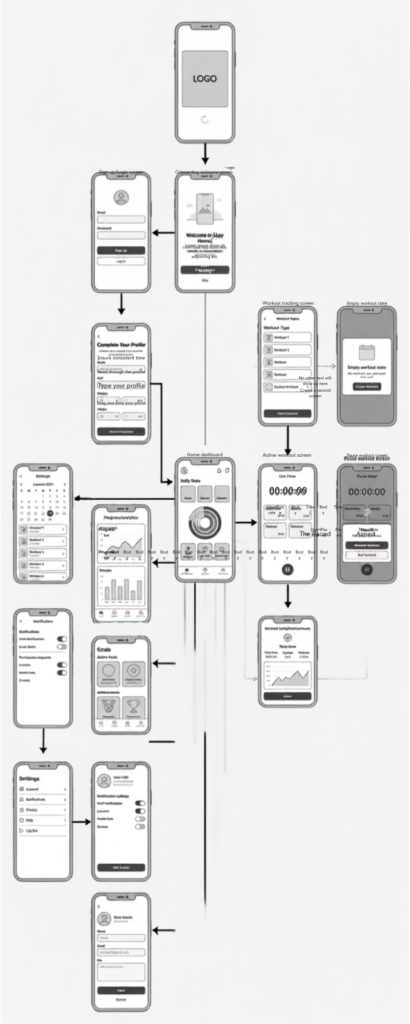
Before you spend a single hour on high-fidelity visual design, a wireframe can already tell you whether your product structure holds up. Two quick methods do most of the work: show someone the bare-bones screens for five seconds and ask what they think it does; or give them a task and ask where they’d click to start.
If you’re deciding how to organize categories, a settings menu, or a course catalog, this is the cheapest point at which to check that your structure matches how people actually group things. Catching it here takes an afternoon; catching it after launch takes a redesign. Here are a couple of more formal methods worth having in your toolkit. These let participants complete the test remotely, at their own convenience, without you needing to be there.
- Card sorting for building the information structure: give participants your content or feature list on cards and let them group it themselves. It reveals categories you’d never have guessed. You also learn what your users actually call things, which can be different from the names you’ve been using for a decade or more. Learn more about Card Sorting.
- Task based testing which I assume that your wireframes cover at least one main flow essential to what your product is supposed to help user. For instance, placing a trade is essential to a stock broking app. You may want to give your participants to complete that task on your wireframe flows.
- First-click testing for a single screen: show it for a few seconds, name a goal, and see where they’d tap / click first. This would tell you if the users have a single point of focus to achieve their task or multiple on-screen controls are creating mental conflict merely due to their presence.
- Tree testing is a bit more advanced method but you can always read more on it before deciding to use it. It is used for checking a structure you’ve already drafted: give participants a text-only outline of your navigation and a task, and see if they can find their way. For example, in case you have multiple products, you can figure out where the participants would look for them. A product not found is a product never bought.
Which tool to use, and why build the wireframe itself in Figma, Balsamiq, or Canva, whichever is fastest and works best for you from a time and cost perspective. To test it, you can run an in-person card-sorting exercise on paper (this works really well if you’re building for a specific audience, e.g. the elderly, university students, etc.), or use UXArmy to run it remotely with participants you source there. Either way, the people you test with must match your target audience and be willing to spend 10-15 minutes on it. That said, for participants, I’d still suggest staying within the network of people you’ve found through your own direct outreach instead of reaching out to a participant recruitment agency.
UXArmy is a practical choice for founders because these features and tools are available without a paywall as far as the number of responses you need are not in the realm of “standards” (although its always “it depends’ in research). So for $29 on monthly plan should not be too taxing. If in case you exceed the free plan, a paid plan works on Pay-as-you-go model. Feel free to reach out to us. Simply fill up the Form on our startup page as UXArmy offers special discounts to startups.
Start this week: list your menu items and other content items on core pages as plain text for card sort. Wireframe your main navigation and run a ten-participant card sort and a usability test with three to four participants thereafter for your core product task.
What to expect: a task completion / success rate and a path map. If most people can complete the task, your navigation structure is probably fine. If the navigation tree shows your participants scattered across unrelated menus, you’ve found the problem to fix. This is a cheap fix before a single screen was designed an.
At the end of this stage you should be able to understand and answer how may the customer reach their objective? Do the customers understand the product navigation, and does it meet their expectations?
Stage 3: Clickable prototype with multiple flows
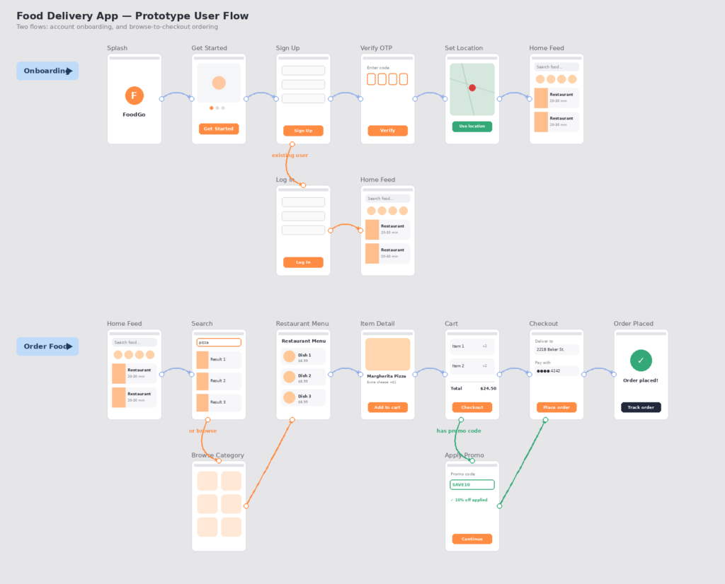
I’d recommend controlling the temptation to jump to high-fidelity Figma screens, or to fire up a design-system-backed LLM (e.g. Claude Design or Google Stitch) and start burning tokens churning out pixel-perfect screens. You can still stay at wireframe level if it’s faster to edit existing wireframes to add new flows. If your designer (or the designer in you) is desperate for something more colorful just to get a better vibe going, you can use LLM prompting to generate screens quickly; but that’s a “want,” not a “need,” at this stage. Staying at skeleton level helps because you spend far less effort keeping things visually consistent.
At this stage, a common founder pitfall is showing the prototype to fellow entrepreneurs, watching them nod along, and calling it validated. But friends already understand the product: they’ve heard you explain it three times. That makes them the worst possible judge of whether a first-time user could figure it out alone.
What actually surfaces problems is watching a stranger attempt a real task e.g. “sign up and send your first transfer abroad”.
- Write the task based on the goal to achieve “Send your first invoice,” not “click the invoice icon, then click send.” The second version tells them the answer instead of revealing whether they’d have found it themselves.
- Two to three participants is enough for a first pass. Even if it’s a well-known rule of thumb for catching most major usability problems with 5 participants, doing more than one round of task based test with 2 or 3 participants yields better results. You must be making improvements after every iteration.
- Record everything (optional) or just the voice. A confusing user interaction moment you can rewatch is worth more than a note written from memory an hour later. Ask participants to narrate their thoughts out loud as they go: what they expect, what confuses them, what they’re about to tap and why. This is called a think-aloud session, and it turns a silent struggle into something you can actually see, hear and fix.
Which tool to use, and why: You can use any usability testing platform you like. UXArmy runs both unmoderated usability tests – recorded as well as not recorded. Some founders choose to run a survey instead using a tool like Alchemer. However an online survey doesn’t allow for task completion so it has a limited value in usability testing.
Start this week: write one task script for the 2 riskiest flow in your product, and get three recorded sessions back before you write a line of production code for it.
What to expect: at least one moment, in most sessions, where someone hesitates and says something like “wait, what does this do?” That hesitation is the most useful thing you’ll learn all week. It’s cheaper to fix now than at any later stage.
Stage 4: MVP, live behind a feature flag
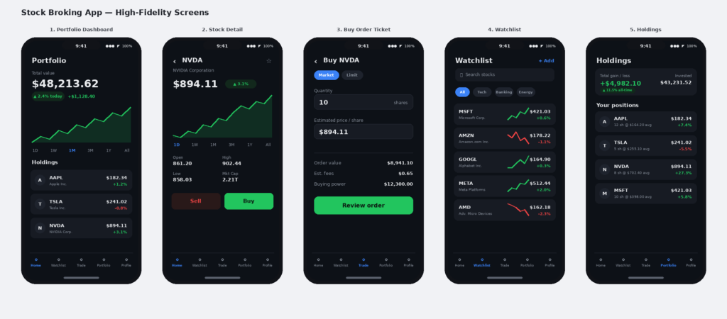
Once the MVP, built on real code and pixel-perfect design exists, the common pattern flips: generally most founders stop watching people use the product and start watching analytics dashboards instead. It’s an understandable shift; there’s finally real data. But a dashboard can show you a drop-off without ever telling you why it happened.
A feature flag lets you release something to a small, controlled slice of real users before it’s visible to everyone. This is useful both as a safety net (turn it off in minutes if something breaks) and as a research tool (watch that small group closely instead of guessing from aggregate numbers). Pair the flag with a usability session on the actual, real build since some problems only appear with real data, real account states, and real load.
- Set the rollout small on purpose. 5 – 15% of users is usually enough to catch a serious problem without exposing your whole base to it.
- Watch the flagged group, don’t just measure them. A funnel number tells you where people dropped off. A short session with two or three of them tells you why.
- Decide your rollback trigger before you launch the flag. “If completion drops below X%, we turn it off” is a decision that’s much easier to make calmly in advance than in the middle of a bad week.
Which tool to use, and why: for the flag itself, LaunchDarkly or a simple flag you build into your own backend both work. The mechanism matters less than having one at all. For analytics, PostHog, Microsoft Clarity, and Mixpanel are common starting points; they’ll show you exactly where the flagged group drops off.
To understand why the drop-off is happening, silent session replays from analytics tools don’t help much. A platform like UXArmy can run online, unmoderated usability tests with a think-aloud protocol, directly on your live build with real users in the flagged group. This is useful precisely because it catches usability issues without you having to run lengthy, expensive scheduled interviews. At this stage, think-aloud with screen recording isn’t optional, the stakes are too high.
I recommend you do not test everything at once. Establish quantitative success criteria beforehand (e.g., 75% of users should complete the checkout flow in under 2 minutes”. Besides the usual usability metrics, you can track Time-on-Task and the System Usability Scale (SUS) score. If case you do not know about the System Usability Scale, it is a single metric you can used to measure usability. UXArmy has a built in SUS score option built into the platform.
Start this week: pick the riskiest features currently planned for next launch, and scope a way to release it to a small percentage first.
What to expect: a real, if small, usage pattern and the ability to fix or reverse a bad decision before it reaches your whole user base.
Stage 5: Live product and real users
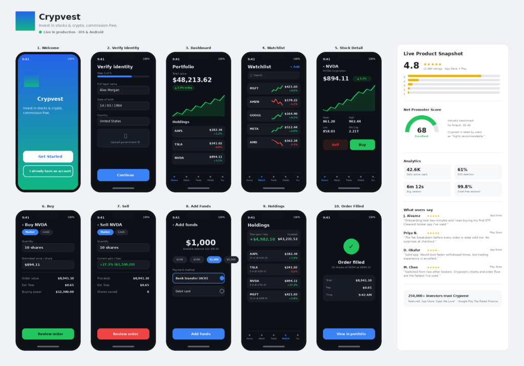
With real users comes a new failure mode: over-listening to whoever happens to be loudest. A handful of vocal power users on a feature-voting board, or one furious one-star review, can end up steering the roadmap more than the quiet majority who are neither delighted nor angry enough to say anything at all.
From this point on, three kinds of signal need to run side by side, because none of them works alone. Passive feedback channels star ratings, feature-voting boards, community discussion, Product Hunt, Reddit are valuable and free, but self-selected toward extremes. Analytics tells you precisely where a problem is happening, but never why. Structured research, run on a regular cadence rather than only when something feels wrong, is what supplies the why and keeps you honest about who your average user actually is.
- Treat passive feedback as an early-warning system, not a prioritization tool. It’s excellent for spotting that something’s wrong; it’s a poor way to decide what matters most.
- Keep a standing usability testing cadence. A short round of usability testing every month with 5 to 8 participants, on whatever shipped since the last round, catches drift before it shows up as churn.
- Net Promoter Score (NPS) A very important indicator of customer loyalty to your brand, NPS helps you stay aware of whether your customers would recommend your product to other people they know. NPS is an 11-point scale (0 to 10). Based on the score selected, a follow-up question asks the respondent to explain the reason behind it. Users who score a 9 or 10 are classified as “Promoters,” and those who score 0 to 6 are classified as “Detractors.” Those who score a 7 or 8 are considered “Passives.” To calculate the NPS score, the percentage of Detractors is deducted from the percentage of Promoters. For example, if 25% of respondents are Detractors, 60% are Passives, and 15% are Promoters, your NPS score would be 15 − 25 = −10. Note that NPS is a relative score that varies by industry and demographic. So a negative score isn’t necessarily poor. Beyond tracking the number itself, it’s just as important to read the open-ended feedback customers give as the reason behind their rating. Continuously analyzing this signal and acting on it is what actually keeps customers happy, loyal, and enthusiastic.
- User Interviews to dive deeper and inform the roadmap At this stage, you must be continuously gathering feedback via various customer signals. But it’s just as important to keep pace with your target audience’s evolving needs. For this, I recommend running immersive deep-dive sessions with your customers at least once a quarter or, at a minimum, three times a year. These help you understand what customers expect and how their workflows are evolving. This matters more than ever now, given how fast AI tech is moving. As a founder myself, I run 5 DeepDive (UXArmy’s user interview tool) sessions every 2 months. Generally, customers are open to sharing their thoughts and ways of working when asked especially, with a small incentive offered as a token of appreciation.
Which tool to use, and why: keep your analytics tool from Stage 4 running as a baseline. For the passive channels, most of these. Reviews, feature voting, community boards are free or near-free and mainly need someone to actually read them regularly.
For the recurring structured research, UXArmy panel might suit an ongoing quarterly cadence of usability testing well, since it keeps a consistent participant panel and testing setup rather than having to rebuild a study from scratch every time; that consistency makes it much easier to tell whether a metric moved because of a real product change or just a different group of testers.
Start this week: block a recurring 90 minutes once a quarter for a small, structured usability round. Plan 5 interviews of 60 min each. Treat it as non-negotiable as a board meeting.
Which tool for which job, at a glance
| Stage | Question you’re answering | Method | Tools to consider |
|---|---|---|---|
| Idea only | Is this a real problem? | Problem discovery interviews | Notebook + Zoom; Spreadsheet |
| Sketch / wireframe | Does the structure make sense? | Card sorting, Basic usability test. | Figma/Balsamiq to build; Research platform to test content hierarchy. |
| Clickable prototype | Can someone use it unassisted? | Usability testing, think-aloud | UXArmy usability testing |
| MVP behind a flag | Does it hold up with real data and real usage? | Usability test on the live build + funnel analytics | PostHog / Mixpanel for analytics. Research platform for think aloud usability testing |
| Live product | Is it working and what should we build next? | Passive feedback + recurring structured research | NPS, Reddit monitoring; Research platform with Scheduling to set up a research cadence. |
Common Founder Pitfalls
- Friends and family aren’t a panel. People who already like you can’t give you an honest first impression it isn’t in their nature to try.
- Five participants finds usability problems, not business priorities. Don’t confuse a good sample size for one job with a good sample size for the other.
- A star rating or is a headline, not the whole story. Both are self-selected toward people who feel strongly, in either direction.
- A drop-off number tells you where; it never tells you why. Treat every surprising analytics number as a question to go ask someone, not an answer by itself.
- The most expensive mistake is testing only after the full build ships. Every stage you skip is a stage where the same mistake would have been far cheaper to catch.
Final word
If you made it this far, congratulations! You are a converted, user-centric startup founder 🙂 Speed really is an advantage, we all know that. Shipping an MVP in six weeks instead of six months is a genuine edge. But speed without a matched way to check your work just means arriving at the wrong answer faster, with more users burned along the way and less trust left to earn back.
The founders who get past the MVP stage tend to be the ones who tested at the right fidelity, at every stage, before deciding what to build next.
“Build fast, fail fast” was always fine advice. It was just missing its second half: test at every stage, and know why you failed instead of finding out from a churn graph three months later. Failing every week in front of your test users should be the kind of dopamine startup founders strive for.
Questions founders ask about this
What is the difference between market research and UX research?
Market research checks whether a problem is real and worth solving. UX research checks whether a specific version of the product works for the people using it. They catch different failures, and a founder needs both at different points.
Do I need a working product before I can start user testing?
No! User testing can start with a hand-drawn paper sketch or a text-only outline of your navigation, well before any code exists. The earlier you test, the cheaper any mistake is to catch.
How many users do I need for a usability test?
Around five participants is a commonly used rule of thumb for catching most major usability problems in one round of testing. It’s a good number for finding interface issues; it is not a large enough sample for prioritization or investment decisions.
Is NPS a substitute for usability testing?
No. NPS measures whether people who chose to respond would recommend your brand. It is a self-selected sentiment signal. Usability testing observes whether people can actually complete a task on your product. They measure different things and don’t substitute for each other.
What’s the cheapest way to validate an idea before building anything?
Talk to people. Find seven or eight people who actually have the problem you’re solving and ask them how they solve it today. Draw your idea on paper and show it to a few of them too. That’s it. Just a notebook, video call and the willingness to ask.