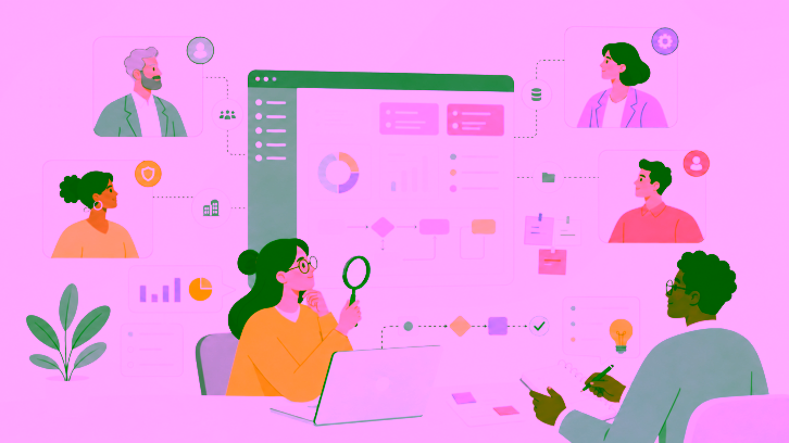
Good design is rarely about taste. It is about whether a real person can move through your product without confusion, hesitation, or frustration. Most teams assume their interface works because it works for them, and that assumption quietly costs them users every single day.
The scale of the problem is larger than most teams expect. Research from the Baymard Institute shows that up to 65% of e-commerce checkout flows fail to meet acceptable usability standards, and a similar share of product pages fall short. That is not a design taste problem. That is lost revenue sitting inside fixable friction.
This article walks through ten UX research insights that consistently improve user experience. Each one is grounded in published research or a real case study, and each comes with a clear action you can apply this week.
Why These Insights Matter
The insights below are not abstract theory. They come from cognitive psychology, human factors research, and measured business outcomes. They matter because they translate directly into the numbers product teams care about:
- Lower abandonment at checkout and onboarding
- Higher task completion rates
- Fewer support tickets caused by confusion
- Stronger conversion from the same traffic
Top 10 UX Research Insights That Drive Better User Experiences
Here are the following 10 insights, starting with the one that has cost companies the most money:
1. Ask Only for Information You Really Need
Every extra field in a form gives people one more reason to pause, misread, or quit.
A well-known example comes from Expedia. A single optional “Company” field reportedly cost the company $12 million a year because users entered incorrect information and payment verification failed. The change that fixed it was not dramatic. They removed the field.
That lesson holds up across sign-up flows, checkouts, demos, and lead forms. If a field is not essential, it should earn its place.
And if you do need to ask for something unusual, add clear microcopy so people do not have to guess what you mean. The fastest way to spot risky fields is still simple: watch real users complete the form. The hesitation points are usually obvious once you stop relying on internal assumptions.
2. Fast Responses Keep Users Engaged
The Doherty Threshold, established in a 1982 IBM study, found that productivity stays high when a system responds in under 400 milliseconds. Below that point, users perceive the interaction as instant and stay in a focused state.
Cross that threshold and the brain registers a delay. The user shifts to a waiting state and has to rebuild context once the screen finally responds.
You cannot always make the backend faster, so manage perceived speed instead. Use skeleton screens, instant button feedback, and optimistic updates that show the result before the server confirms it. The goal is a product that feels continuous, even when work is happening behind the scenes. Test these moments to confirm they actually feel fast to users, not just to your team.
3. Too Many Choices Slow People Down
More options do not always create a better experience. Quite often, they create avoidance.
Hick’s Law states that decision time increases with the number of choices. In real products, that shows up as cluttered menus, crowded homepages, and pricing pages that ask users to process too much at once.
When people hit a wall of choices, they do not always compare carefully. They often postpone the decision.
A better approach is progressive disclosure. Show what matters now. Reveal the rest when it becomes relevant. Netflix does this well with curated rows such as “Top 10,” which reduce scanning effort without reducing available content. And before locking in your information architecture, run a card sort. Users are usually much better at telling you how content should be grouped than internal teams are.
4. Progress Encourages People to Finish
The Zeigarnik Effect, identified in 1927, found that people remember incomplete tasks far more strongly than finished ones. An open loop creates a small tension the brain wants to close.
You can use this to lift completion rates in a few proven ways:
- Show a progress meter, such as “Your profile is 80% complete”
- Give an artificial head start, like a sign-up bar that already shows 20 percent
- Break long forms into short, multi-step stages
There is one rule. Apply this honestly. If a user reaches the end and hits a surprise paywall or a hidden step, the tension turns into frustration, and trust breaks down. Use the effect to guide users forward, never to trap them. For deeper guidance on shaping these flows, see how to analyze qualitative research data to spot exactly where users stall.
5. People Remember the Best and Last Moments
Users do not remember every moment equally.
The Peak-End Rule, from a 1993 study by Nobel laureate Daniel Kahneman, holds that people tend to judge an experience based on its most intense moment and its ending, rather than the average of every step in between.
That is a useful design constraint. It means not every screen carries the same emotional weight.
If you want a journey to feel better, pay extra attention to two places: the moment of highest tension or reward, and the final step. A confirmation screen after checkout should not feel like an afterthought. A resolved support ticket should not end with ambiguity. And when something goes wrong, the error state matters more than teams often realize. A stressful failure can become the one thing a user remembers.
As shown in the source URL above, Mailchimp is a good example of the Peak-End Rule, turning the stressful act of sending a campaign into a more rewarding confirmation moment.
6. Keep Information Easy to Process
Working memory is limited. When an interface asks people to hold too much in their head at once, mistakes go up.
Miller’s Law, from 1956, is often summarized as the idea that working memory can hold only a small number of items at a time. That does not mean every menu should have seven items. It does mean information becomes easier to process when it is grouped into meaningful chunks.
Think about the difference between reading a long unbroken string and reading a phone number grouped into familiar parts. The second version is easier because the brain does not have to decode everything from scratch.
In interfaces, good chunking shows up in grouped settings, scannable sections, logical headings, and forms that do not try to do too much at once. If users cannot find what they need, test the structure itself. A card sort test is often the quickest way to learn how people naturally group and categorize information.
7. Good-Looking Designs Can Still Be Hard to Use
The Aesthetic-Usability Effect describes how users perceive attractive interfaces as more usable, even when they are not. A 1995 Hitachi study found a strong link between visual appeal and perceived ease of use, regardless of actual performance.
This matters most during testing. Users may praise a polished screen while quietly failing the task in front of them.
To avoid being misled, measure behavior, not opinion. Track task completion rates, error frequency, time on task, and rage clicks. These numbers tell you what users actually did, not how the design made them feel. When a usability test produces glowing comments but poor completion rates, trust the completion rates. The gap between what users say and what they do is where the real problems hide.
8. Make Important Actions Stand Out
Before people consciously decide what to do, the interface has already suggested what matters.
The Von Restorff Effect, proven in 1933, states that the item that differs most from its surroundings is the one most likely to be noticed and remembered first. In design, contrast is how you make that work in your favor.
That might mean:
- one strong primary button while secondary actions stay quiet,
- a pricing plan that is clearly emphasized,
- or an error state that is impossible to miss.
The danger is overdoing it. If everything is trying to stand out, nothing does. Strong visual hierarchy depends on restraint.
It is also worth remembering that color alone is not enough. Size, spacing, placement, and shape all help reinforce emphasis, especially for users with color vision deficiencies.
9. Accessibility Drives Revenue, Not Just Compliance
Accessibility is often treated as a legal checkbox. The data tells a different story. When Tesco built an accessible version of its grocery site with the RNIB, online sales rose sharply, and the accessible portal generated millions in new annual revenue.
Sighted users often preferred the accessible version because it was faster and simpler.
This is the key insight. Accessibility improvements help everyone. Clean heading structures, descriptive alt text, and keyboard-friendly navigation make products easier for screen readers while also improving search rankings and load times. Building inclusively also reaches the 1.3 billion people worldwide living with disabilities. For a practical starting point, see how to approach measuring accessibility in your own product so improvements are tracked, not guessed.
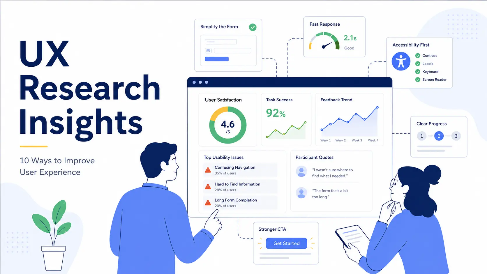
10. Clear Product Images Increase Confidence
Product pages are a major drop-off point in e-commerce, with more than half of major platforms scoring as mediocre or worse. A common cause is imagery that fails to show scale, so users cannot judge how large a product actually is.
When a shopper cannot tell whether an item is the right size, they hesitate, and hesitation kills conversion.
Fix this by showing products in context. Include images with a sense of scale, such as a bag worn by a person or a lamp shown beside familiar furniture. Add zoom, multiple angles, and short clips where they help. The goal is to answer the silent question every shopper has before they commit. Watching real shoppers move through your product pages reveals exactly which images create doubt and which build confidence.
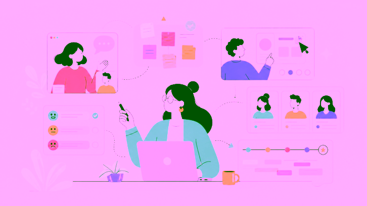
Turn UX Research Insights into Product Improvements with UXArmy
The value of UX research lies in what you do with the findings. While identifying usability issues is important, acting on them quickly is what drives better user experiences, higher conversions, and stronger business outcomes. UXArmy helps product teams move from research insights to confident design decisions by providing a comprehensive suite of user research solutions.
With UXArmy, you can:
- Conduct remote unmoderated usability testing to observe real users completing key tasks and uncover friction points in forms, navigation flows, page layouts, and user journeys.
- Validate site structure and content organization through card sorting and tree testing to help teams optimize information architecture before development begins.
- Gain deeper behavioral insights with moderated user research, enabling researchers to ask follow-up questions and uncover the motivations behind user actions.
- Recruit participants that match your target audience worldwide through UXArmy’s extensive global research panel.
- Conduct studies in local languages to gather authentic feedback from diverse user segments and markets.
Whether the goal is to improve conversion, validate a concept, or fix a weak point in an existing product, the core idea is the same: research should reduce guesswork.
Final Thoughts
The fastest-improving teams are usually not the ones with the best instincts. They are the ones that turn what they learn into specific changes, test those changes, and keep going.
If there is one thread connecting all ten insights above, it is this: people do better when products remove uncertainty. Clearer forms, faster-feeling interfaces, better structure, stronger hierarchy, more accessible experiences, and more confidence-building product pages all reduce the effort users have to spend figuring things out.
Start with the friction point already affecting your numbers. Fix that first. Then validate the change with real users and see what moves.
Frequently Asked Questions
What is a UX research insight?
A UX research insight is an actionable conclusion drawn from user data. It explains not just what users did, but what it means and what change you should make in response.
How quickly can these insights improve user experience?
Many produce results fast. Removing a form field, fixing a confusing label, or speeding up perceived load time can lift completion rates within a single release cycle once validated with users.
Do I need a large sample to act on these insights?
No. Qualitative usability testing with around five users surfaces most major problems. Larger samples matter only when you need statistically reliable metrics across your whole user base.
Which insight should I start with?
Start with the one matching your biggest drop-off. If users abandon checkout, focus on form fields and speed. If they cannot find features, run a card sort and tree test first.
How do I know if a design problem is real or just a preference?
Measure behavior, not opinion. Track task completion, error rates, and time on task. If users praise a screen but fail the task, trust the behavior over the comments.