


You didn’t stay up until 2 AM for six months and quietly drain your savings account just to end up here, writing another feature nobody asked for. But that’s probably what you’re about to do.
Here’s the pattern: the app is live, the code is real, actual users are clicking actual buttons, and your bank balance has gone a bit thin, the kind of thin that makes you flinch slightly when the card machine asks “contactless or chip.” And now that there’s finally something real to look at, a strange new fear shows up: looking too closely might tell you something you don’t want to hear. So instead, you build. A new feature, a redesign, anything that feels like forward motion, because motion feels safer than sitting still and asking the hard question.
This isn’t a “your baby is ugly” intervention. I’m not here to tell you your product is bad. This is about money and your time. You’ve already spent it building this thing, so the goal now is making sure the next dollar goes somewhere smarter than the last one did, and the only way to know that is to actually look. Properly, this time. Not “checked the dashboard for eleven seconds and felt vaguely okay about it.”
If you’ve read the napkin-sketch version of this playbook, you already know the drill: ask people, don’t guess, and stop treating “research” like a locked door only researchers get to open. Same idea here, just with higher stakes. You’re not testing an idea anymore. You’re testing whether real money is going where you think it’s going.
Still at the idea stage, nothing live yet? This one’s not for you. Go read 5 Experiments You Can Run in 15 Minutes for Product Concept Validation instead, and come back once you’ve actually shipped something.
The rule that makes all five of these work
Learn what people do, not what they’d want.
“How do you currently find out that a customer’s about to cancel?” tells you something real, usually a support ticket, a frustrated sales call, or a Slack message from your Customer Success lead going: Hey, this account’s gone quiet, should we be worried?
Now compare that to: Would you find it useful if we could predict churn before it happens?
That tells you nothing, because who’s going to say no to that?
Every experiment / method below leans on this one habit.
If you take nothing else from this piece, take that line.
1. Cognitive Walkthrough (preferably AI-assisted)
This one costs you nothing but an hour and a bit of humility, and it’s the cheapest way to find out where your MVP is confusing before you spend money finding out from real users. A cognitive walkthrough is normally a trained UX researcher’s tool: pick a real task, step through it screen by screen, and at every single step ask one question, “would a first-time user know what to do right here, right now, with no help from me?” You’re not reviewing whether the product works. You’re reviewing whether a stranger would know it works, which is a different thing entirely.
However, you don’t necessarily need a research background to run a rough version of this yourself. Pick one task that matters, approving an expense report, inviting a teammate, connecting a bank account, whatever your product’s core moment is, and walk through it step by step pretending you’ve never seen the product before. At each screen, write down what a first-timer would need to already know to get through it. If the answer is “they’d need to have read our help doc” or “they’d need to already know what we mean by ‘workspace’,” you’ve found a gap.
Here’s the catch: you are structurally bad at this. You built the thing, so you already know what every button does, which means you can’t actually experience the confusion a stranger would. This is exactly where an AI assist earns its keep, feed a tool like Claude your screens or a written description of the flow, ask it to role-play a first-time user with no context, and ask it to flag every point where it would hesitate or guess. It won’t replace real users later in this list, but it does a more disciplined pass than most founders manage on their own, mainly because it has no memory of building the thing and no ego riding on the answer.
Here is an example Prompt:
“I’m building a digital insurance app. I’m going to describe (or paste screenshots of) our claims-filing flow, screen by screen. I want you to role-play as a first-time user who has never used our app before, has just been in a minor car accident, is mildly stressed, and has no prior knowledge of insurance jargon like “excess,” “adjuster,” or “FNOL.”
Walk through the flow one screen at a time. At each screen, tell me:
- What you’d expect to happen when you look at this screen, before you do anything
- Whether it’s obvious what to do next, or whether you’d hesitate
- Any word, icon, or label you wouldn’t understand without help
- What you’d guess incorrectly, if anything, and what that wrong guess would cost the user (a wasted click, a delayed claim, or something worse)
Don’t be polite about it. Assume I already know the happy path works, I need to know where a confused, slightly panicked, first-time user would get stuck.
Give me the output as a table: Screen | What I’d expect | Where I’d hesitate | Words I wouldn’t understand | What I’d get wrong.
Here’s the flow: [paste screenshots, or describe each screen in order]”
A good result looks like a short, specific list, three or four exact moments where intent isn’t obvious, not a vague “onboarding could be smoother.” A bad result is finishing the walkthrough with nothing flagged at all. That almost never means your product is flawless. It usually means you weren’t actually able to unsee what you built, and it’s worth getting a second pass, human or AI, before you conclude there’s nothing here.
The mistake founders make with this one is treating it as the finish line instead of the starting gun. A cognitive walkthrough doesn’t confirm anything, since you’re still just one biased opinion evaluating your own work. Its whole job is narrowing down what’s actually worth spending real usability testing budget on next.
2. Remote Moderated Usability Testing
This is the point where you stop guessing and actually sit with a real person while they use your live product, in real time, even if “sit with” means a video call instead of a room. It costs more than the walkthrough, an hour or two to set up, thirty to forty-five minutes per session, but it’s the method that actually tells you why something’s broken, not just where.
Pick one or two tasks that matter, the same instinct as the walkthrough, except now you’re handing it to someone who’s never seen your product before and watching what actually happens. For a digital insurance app, that might be “file a claim for a fender-bender that happened this morning.” Ask them to think out loud as they go, what they expect, what confuses them, what they’re about to click and why.
Resist every urge to jump in and help.
The silence where they’re stuck is the most valuable thirty seconds of the whole session.
Three to Five participants, run one at a time, is enough for a first pass. You’re not collecting a statistically significant sample, you’re watching for the same friction point showing up more than once. If more than one person hesitates at the exact same screen or get stuck, you’ve found something real.
Recruiting is usually the actual bottleneck here, not the session itself. If your own network can get you five people who genuinely match your target user, that’s the cheapest option. If it can’t, and for a lot of founders it can’t, a research panel platform like UXArmy exists specifically to solve this, matching real participants to your target profile and handling scheduling so you’re not spending your week chasing calendar invites instead of running sessions.
A good result is walking away with two or three specific, fixable moments, not a vague feeling that “it went fine.” If nobody struggled with anything at all, that’s rarely a sign of a flawless product. It’s usually a sign the task was too close to the happy path, or that you coached them without realizing it.
The mistake founders make here is treating a moderated session like a demo instead of a test. The second you start narrating, “so this button here does X,” you’ve stopped testing the product and started testing your own explanation. If you catch yourself about to jump in, that’s the exact moment to stay quiet.
3. Remote Unmoderated Usability Testing
Here’s the difference: moderated testing gets you depth from a few people, unmoderated gets you a wider scan without you having to sit through every single session live. Same underlying idea, real tasks on your real, live product, but instead of watching someone in the moment, participants record themselves completing the tasks on their own time, and you review the footage afterward.
This is where it earns its place in the lineup rather than just duplicating Point 2: it scales in a way moderated testing can’t. You can send the same task script to fifteen or twenty people instead of five, at roughly the same cost in your own time, because you’re not blocking out a chunk of your week to sit through each one live. That matters most once you already have a hunch about where the problem is, from the walkthrough, from Point 2, from your own analytics, and you want to know how widespread it actually is, not just confirm it exists.
Write the task the same way you would for a moderated session, a goal, not a set of steps. “File a claim for a fender-bender that happened this morning,” not “tap the claims icon, then tap new claim.” The second version tells them the answer. Ask for think-aloud narration if your tool supports screen recording with audio, most do, since the value of unmoderated testing drops fast without it, you’re left watching a cursor move with no idea why.
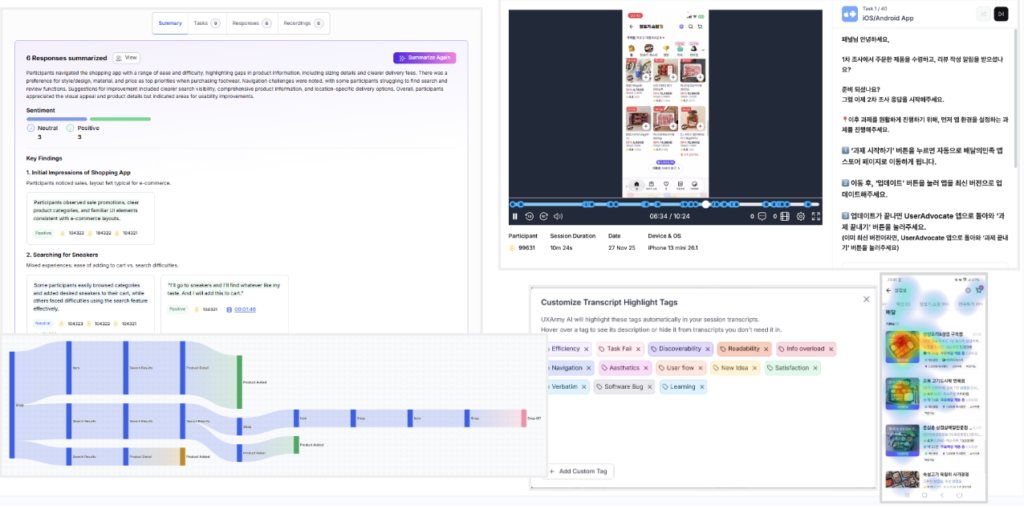
Recruiting works the same as moderated testing, your own network if it stretches far enough to match your real user, a panel platform like UXArmy if it doesn’t, the only difference is you’re briefing people once instead of scheduling calls one at a time.
A good result is a pattern holding up across most of the recordings, if twelve out of fifteen people sail through a task, that’s a real, wider confirmation of something your moderated session only hinted at with five. A failed task is actually useful data, it’s getting the recordings back and skimming them at double speed without watching where people actually paused or backtracked. The value is in the moments of hesitation, and those are easy to blow past if you’re rushing through footage the same way you’d rush through a dashboard.
The mistake founders make here is treating this as the cheaper, lazier version of moderated testing and writing sloppier tasks because “nobody’s watching me run it.” A vague task produces vague footage no matter how many people you send it to. The script is doing more of the work here than it did in Point 2, since you don’t get a chance to clarify or redirect once it’s live. Writing too many tasks makes the participant bored and lack of attention would give you invalid feedback. So avoid more than 3 to 4 key tasks. Supplement those with a couple of survey questions.
4. Session Replay Autopsy
Everything up to this point has involved you assigning a task and watching what happens. This one flips that entirely, no script, no assigned task, just real people using your real product however they actually use it, recorded automatically, with you watching afterward like a detective walking through security footage.
Tools like PostHog and Mixpanel record real user sessions on your live product, every click, every scroll, every rage-click where someone taps the same dead button four times because nothing’s happening. The advantage over everything in Points 2 and 3 is that nobody’s performing for you. There’s no task script nudging someone toward the flow you had in mind, no awareness that they’re being watched, just whatever actually happened when a real person with a real problem showed up to your product on a random Tuesday.
Start with the journey you care about the most, yes. The recordings or session replays. At this stage of your startup, there might be more to watch than the analytics itself. At least a couple of session replays are worth watching to learn where the drop offs, deadclicks and hesitations are.
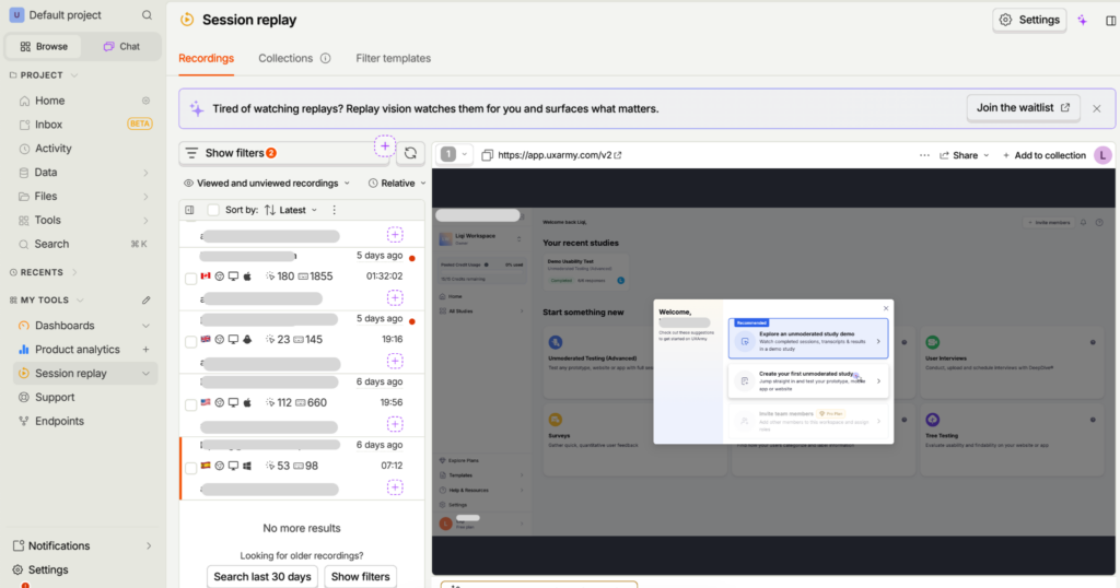
Watch for the same three or four things repeating. One person hesitating at a screen could be anything, they got a phone call, their dog needed feeding. Ten people all pausing at the exact same field, or all rage-clicking the same spot, is a pattern, and patterns are what you’re actually looking for here.
A good result is walking away with a short, specific list, the same three or four moments showing up again and again across recordings. A bad result is watching one or two sessions, shrugging, and calling it done, ten to fifteen isn’t a huge number, but it’s enough to tell a real pattern apart from one person having a bad afternoon, and stopping early is the fastest way to convince yourself of the wrong thing.
The mistake founders make here is staring at the aggregate dashboard, seeing a drop-off percentage, and stopping there. A number tells you where. It never tells you why. The percentage is the invitation to go watch the recordings, by running a usability test to validate points of drop offs.
5. The Number Check
Every method so far has involved watching or listening to someone else. This last one doesn’t.
Pick the one metric that would genuinely kill your favorite excuse if it came back bad. Not signups, signups measure curiosity, not whether the product works. For most live products, a good number is something like week-2 retention, repeat purchase rate, or for the insurance app, the percentage of started claims that actually get finished without someone abandoning halfway through. Whatever it is, it should be the number you’d least want to say out loud in front of someone else, that’s usually a sign you already suspect it’s not where it needs to be.
Then say it out loud. Not to yourself, not in a note only you’ll read, to a cofounder, an advisor, a mentor, anyone whose opinion you actually respect. “Our week-2 retention is 11%” is a sentence that’s uncomfortably easy to skip past in your own head and surprisingly hard to say to another person without immediately following it with “but that’s because…” Notice that instinct. It’s the same instinct that’s been quietly justifying the last three feature releases instead of asking whether any of them moved the number at all.
This works because of a specific, well-documented human habit, it’s much easier to rationalize a bad number in private than to defend it out loud to someone whose judgment you respect. Saying it to another person changes what the number is allowed to mean to you.
A good result is a genuinely uncomfortable ten minutes, followed by one clear next question, “why is this number what it is,” instead of a next feature. A bad result is picking a metric that doesn’t actually threaten anything, revenue when you know the real issue is retention, for instance, because it’s easier to say a soft number out loud than a hard one. If the conversation doesn’t sting a little, you probably picked the wrong number.
Avoid skipping straight to solutions in the same conversation, “our retention’s low, so we should probably add X.” Not yet. The entire point of this method is sitting with the number long enough to actually understand why it’s true, before jumping to what might fix it. That question belongs in Points 1 through 4, not in the two minutes right after you’ve finally said the number out loud.
Which one do I run first?
- Haven’t looked at your own product with fresh eyes in months? Start with #1, the walkthrough. It costs you nothing but honesty and tells you where to point everything else.
- Have a hunch about where people are struggling and want to actually understand why? #2, moderated. Five real people, thirty minutes each, watched live.
- Already confirmed a problem with a handful of people and want to know how widespread it really is? #3, unmoderated. Same task, more people, less of your week.
- Already have PostHog or Mixpanel running and haven’t looked past the dashboard? #4. Ten to fifteen recordings, watched properly every two days, not skimmed.
- Kept shipping features instead of asking whether any of them worked? Or avoiding a number you already suspect is bad? #5. Say it out loud, this week, to someone whose opinion you respect.
You don’t need to run these in order, and you don’t need to run all five before you’re allowed to build again. Pick whichever one matches where you actually are right now, not where you wish you were.
The point of all this
None of this was ever about proving your product is bad. It was about making sure the next dollar you spend, the next feature, the next redesign, the next thing you burn a weekend building, goes toward something you actually looked at first, instead of something you guessed at from the comfort of not looking.
You already spent the hard part, the burnout might be lurking. The five things above cost you an afternoon, not another six months. That’s a good trade, and it’s one most founders never actually make, not because it’s hard, but because looking closely feels riskier than it actually is.
If you’re still at the idea stage and haven’t built anything yet, none of this applies to you quite yet, go run [5 Experiments You Can Run in 15 Minutes for Product Concept Validation] instead. And if you want the full shape of this, testing across a startup’s entire first year, from a napkin sketch to a live product with real revenue on the line, that’s laid out in From Sketch to Scale: A Founder’s Playbook for Testing What You Build.
Your product probably isn’t as broken as your worst midnight fear says it is. It’s also probably not as fine as your dashboard says it is either. The only way to find out which one’s closer to true is to actually go look.