


Nobody on your team can use your website like a first-time visitor, because nobody on your team is one. You know what the navigation labels mean, which of the three buttons is the real one, and what happens after the form submits. Nielsen Norman Group’s position on this is blunt: because ordinary users carry none of that insider knowledge, they consistently run into problems the people who built the site never thought to look for. Finding such unforeseen problems is the whole reason website usability testing exists.
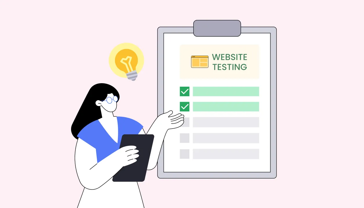
Website usability testing is a research method in which representative users attempt to complete realistic tasks on a website while researchers observe where they succeed, hesitate or fail.
It answers whether people can accomplish their goals on the website, not whether it works as specified. The result is a set of specific, prioritized usability problems grounded in observed user behavior. Internal reviews cannot replace this testing because people involved in building a website already know its structure, terminology, and intended behavior. That familiarity makes it difficult to identify problems that are obvious to new or unfamiliar users.
Analytics can show where users drop off. A/B testing can show which of two versions produces a better outcome. Neither necessarily explains why users struggle. A usability test can reveal issues such as an address field rejecting a valid postal code or a shipping estimate being mistaken for the final price.
This guide explains what website usability testing evaluates, how it differs from engineering QA, which testing method to use for different research questions, and what to measure so findings can inform product decisions and roadmap priorities.
- Website usability testing evaluates how easily real users can understand, navigate, and complete tasks on a website. It can be conducted on early prototypes as well as live websites.
- Different website usability testing methods answer different questions. Task-based testing surfaces where people get stuck, tree testing isolates whether the problem is your information architecture, and first-click testing shows whether the entry point is the issue.
- Test before and after launch. Prototype testing catches problems while they are cheap to fix. Live-site testing reveals issues that emerge with real users and conditions.
- Usability testing and QA testing are not the same thing. QA checks whether a website works correctly; usability testing evaluates whether people can use it effectively.
- A research platform can make website usability testing easier to run consistently and at scale. Platforms can bring participant recruitment, study setup, remote testing, recordings, surveys, and other research activities into a more streamlined workflow, making it easier for teams to test, learn, and retest throughout the website lifecycle.
What does website usability testing evaluate?
It answers a narrow question: can the people you built this for actually do what they came to do? That is worth separating from the questions your team is probably already asking. Analytics tell you what happened at scale. A/B tests tell you which of two design options performs better. Usability testing reveals the specific behaviors and usability problems behind those outcomes, giving you context that analytics and A/B tests cannot provide on their own.
4 things website usability testing reliably surfaces:
- Identify experience gaps, content and comprehension problems. The moments where what the website offers and what the user expects do not line up such as a label that means something different to your team than to your customers or a flow assuming knowledge that first-time visitors do not have.
- Design decisions that need validating. Every layout, label and flow encodes an assumption about how people will read it. Usability testing is how those assumptions get checked against behavior before they ship.
- Accessibility barriers. Automated checkers catch contrast ratios and missing alt text. They do not catch a screen reader user who cannot tell which of four identically labeled links goes where. Testing with real users who rely on assistive technology finds the failures that pass automated audits.
- The cost of fixing things late. Problems found in a prototype are cheaper to change. The same problem found after launch carries development rework, migration risk and potential revenue loss while the issues just stay there.
For a broader look at the role of usability testing in product decisions and development, see Why Is Usability Testing Important in Product Development?.
Why it matters more now
Two shifts have raised the stakes. Websites have become more dynamic and personalized, which means fewer users see identical experiences and more edge cases exist to fail in. With AI-assisted tooling, teams produce interfaces faster than they can validate them, compressing the design and build cycle. Speed of production without a matching increase in validation just means shipping untested assumptions more efficiently.
Common Usability Issues Found on Websites
Website usability testing can reveal many different types of problems. The specific issues depend on the website, its users, and the tasks being tested, but several patterns appear repeatedly across websites.
1. Navigation and findability problems
Users may struggle to determine where to go, which category contains the information they need, or which navigation option will take them to the right destination. For example, a participant might search for a product under the wrong category because the site’s labels do not match how they think about the product.
Navigation-specific methods such as tree testing, card sorting, and usability testing (moderated and unmoderated) can help identify whether the problem lies in the information architecture, labels, or interface itself.
2. Unclear content and terminology
Users can become stuck when headings, labels, instructions, or product descriptions use language they do not understand. This can happen when a website uses internal terminology, overly technical language, vague labels, or copy that does not clearly communicate what happens next.
A website usability test can reveal this problem by showing how participants interpret content without the context the product team already has.
3. Difficult forms and input
Forms are a common source of usability friction, particularly when users are unsure what information is required, do not understand a field, or encounter errors they cannot easily resolve. Baymard Institute’s large-scale ecommerce usability research found that 17% of users have abandoned a checkout because it was too complicated or long, showing how form and flow friction can directly affect whether users complete an important task.
Website usability testing can reveal issues such as unnecessary fields, unclear labels or instructions, confusing error messages, and validation behavior that interrupts users. Rather than assuming a form is straightforward because the team understands it, observing representative users can reveal where they struggle and what prevents them from completing the task.
4. Broken experiences or confusing flows
Users may be able to understand individual screens but still struggle to complete the overall journey.
This can happen when:
- The next step is unclear.
- Important information appears at the wrong point in the journey.
- Users are unexpectedly redirected.
- A process contains unnecessary steps.
- The system behaves differently from what users expect.
Task-based usability testing is particularly useful here because it lets researchers observe the entire journey rather than evaluating screens in isolation.
5. Mobile usability problems
A website that works reasonably well on desktop may become difficult to use on smaller screens. Some commonly seen website usability issues on mobile browsers are tap targets being too close together, tables that force horizontal scrolling, sticky elements that eat a third of a small screen, and flows that assume a hover state exists.
Testing on actual mobile devices under realistic network conditions with participants will surface problems that testing on a resized browser tab will not.
6. Accessibility barriers
Usability testing can also reveal situations where people with different abilities have difficulty completing tasks. However, user research should complement, not replace, formal accessibility evaluation.
Accessibility testing may include standards-based checks against the Web Content Accessibility Guidelines (WCAG), keyboard testing, screen-reader testing, and testing with people who use assistive technologies. W3C’s guidance on evaluating web accessibility recommends combining evaluation tools with knowledgeable human review, since no automated tool can determine on its own whether a website meets accessibility standards.
When accessibility is a research question, recruit participants who reflect the users affected by the experience and make the test itself accessible.
7. Lack of confidence or trust
Sometimes users technically can complete a task but hesitate because the website does not give them enough information or reassurance.
Examples include uncertainty about:
- Whether an order was submitted.
- What will happen after clicking a button?
- Why is personal information being requested?
- Whether a payment was successful.
- Whether an action can be reversed.
These problems may not appear as conventional bugs, but they can still prevent users from completing important tasks.
Methods for website usability testing
The method question is really a diagnostic question. You are not choosing a technique, you are choosing which layer of the site you want to interrogate. A task failure tells you something is wrong; the method determines whether you learn that the structure, the labeling or the page itself caused it.
| Method | What it helps evaluate | Best used when |
|---|---|---|
| Moderated usability testing | How users navigate and complete tasks, including where & why they struggle Sessions can be led by a human moderator or supported by AI to conduct structured conversations and follow-up questions | You need to understand user behavior, expectations, and the reasons behind usability problems. AI moderation can also help teams run structured sessions at greater scale, with researchers reviewing the resulting sessions and findings |
| Unmoderated usability testing | Task completion, behavior, and participant feedback without a live moderator | You want to test with more participants or across different locations and time zones |
| First-click testing | Whether users know where to click first to begin a task | You want to evaluate the discoverability of navigation, links, buttons, or other interactive elements |
| Five-second testing | Whether people grasp what the page is and what it offers | You are validating a homepage, pricing page or new landing page proposition |
| Tree testing | Whether the information architecture itself is at fault, independent of visual design | Task testing shows people cannot find things and you need to isolate the cause |
| Card sorting | How users expect content to be grouped and labeled | You are building a new structure, or rebuilding one that is failing |
| Usability surveys | How the experience felt, and how widely an issue occurs | You have qualitative findings and need to know their scale |
| Session replay and heatmaps | Where people actually go on a live site, and where they stall | You are deciding what to test next rather than explaining what you found |
These methods are not mutually exclusive. A team might use analytics to identify a high-drop-off page, usability testing to understand why users struggle there, and a survey to gather broader feedback about the experience.
When should you run a website usability test?
The short answer is at every stage, because the question changes at each one and so does what you can still afford to change.
Early design, on wireframes and prototypes. You are testing structure and concept before anything is built. Can people find the path, does the model make sense, are the labels right? Findings here are nearly free to act on, since changing a prototype costs a design decision rather than a sprint. This is the highest-leverage point to test and the one most often skipped.
Mid-build, on working flows. Individual journeys are functional but the website is not finished. You are checking whether the flow holds up when the content is real and the interactions actually respond. Problems found here are still cheap, and this is where prototype findings get confirmed or contradicted.
Pre-launch, on the staged website. The last point at which structural change is realistic. Test the two or three journeys that carry the most business value end to end, on actual devices with specifically recruited participants. The goal is catching anything that would be expensive to discover from production traffic.
Live website, on a recurring cadence. The site is in front of real users, the content keeps changing, and the traffic mix shifts. Live website usability testing catches what only appears under real conditions, and it gives you a baseline to compare against after each change ships. Analytics tell you something moved; a usability test tells you why.
A practical cadence for most teams combines two things: a round of usability testing whenever a significant flow changes, and a standing quarterly round on the highest-value journeys whether or not anything changed.
The first type of usability test only ever inspects what you just changed, so it misses the problems that no single change caused. Menus grow, content accumulates, features stack up, and a journey that worked a year ago becomes harder to complete without any one edit being to blame. The quarterly usability testing round is what catches that slow drift, and it is also the one teams skip first, because running a test with no recent change to point to is easy to treat as optional.
How to run a website usability test
A website usability test should be built around a clear question and realistic tasks. The goal is not to test every part of a website at once, but to focus on the journeys, pages, or interactions where usability matters most. A practical process looks like this:
1. Plan
Decide what decision your study will inform, then work backwards to the tasks. Website tasks should map to real journeys, which means starting from your highest-value or highest-drop-off flows rather than from whatever page was recently redesigned.
Write tasks as goals, not instructions. “Find a jacket under $100 that can be returned in store” tests the site. “Click the filter menu and select price” tests whether the participant can follow directions.
2. Recruit and schedule
Match participants to your actual visitors, not your target persona document. For a live website, that usually means people who have a genuine reason to use it and have no prior familiarity with its structure. Where the website serves distinct audiences, recruit separately for each rather than averaging across them.
3. Collect
Run the sessions on real devices, with the device mix reflecting your actual traffic. If 60 percent of your visitors arrive on mobile and all your testing happens on desktop, you are testing the minority experience. Record screen and audio, and capture task outcomes as you go rather than reconstructing them afterwards.
4. Analyze
Separate what happened from what it means. Group observations into issues, tie each issue to the evidence behind it, then rate by frequency and severity. Resist the temptation to report a percentage from a small qualitative sample.
5. Report
Lead with the decision the study was meant to inform. For each issue, state what was observed, how many participants faced it, what it cost them, and what changing it would involve. Findings that arrive without an implementation cost attached tend to stay in the deck.
6. Improve and retest
Prioritize the issues worth fixing, ship the changes, then test again to confirm they worked. A fix is a hypothesis until a second round shows the failure is gone and that the change did not introduce a new problem elsewhere in the flow. Building the retest into the change, rather than treating it as a separate project, is what turns testing from a one-off audit into a loop that compounds.
Read about the full process in the usability testing pillar guide.
What to measure
Observations tell you what is wrong. Metrics tell you how wrong, and they are what turns a finding into something a roadmap conversation can act on.
Four measures cover most website testing:
Task success rate. The proportion of participants who completed the task, using a definition of success you set before the study. This is the headline number and the one most often distorted, usually by counting partial completions generously.
Time on task. How long completion took. Useful for comparing a redesigned flow against the version it replaced, and close to meaningless in isolation, since fast can mean efficient or can mean guessing.
Error rate. How often participants took a wrong action, and whether they recovered. A task with a high success rate and a high error rate is a task people are muscling through, which usually shows up later as support volume.
Post-task ease or confidence ratings. A single question after each task asking how difficult it felt. Cheap to collect, and it surfaces the gap between participants who succeeded comfortably and those who succeeded but found it hard. That gap is often where the real problem is.
Each of these metrics becomes far more useful once you are tracking it consistently across rounds rather than reconstructing it each time. For how the core metrics are defined, benchmarked and calculated, see our guide to quantitative usability testing methods.
Best Practices For Website Usability Testing
Write tasks from real user goals. Start from what people come to do on the website, not from the pages you want feedback on. A task that names the UI element you are testing has already given away the answer.
Test the journey, not the page. Website problems compound across steps. A search result page that tests fine in isolation may still fail when reached from a category page that set the wrong expectation.
Match the device mix to your traffic. Check analytics before deciding session logistics. Testing exclusively on desktop for a site with majority mobile traffic produces findings that do not apply to most visitors.
Recruit beyond your own team. Colleagues, friends and existing power users all carry insider knowledge, which is precisely what you are trying to test without. This is the single most common compromise and it quietly invalidates the study.
Set success criteria before you run your study. Define what counts as completing each task in advance, and hold to it. Judging success after the fact, with the sessions already in front of you, is how a participant who struggled to the finish quietly gets marked as a pass and inflates the number.
Retest after changes are shipped. A fix is a hypothesis until someone confirms it worked. Building the retest into the change, rather than treating it as a separate project, is what stops the loop from breaking.
Test on a cadence, not just on occasions. Tie testing to flow changes, and hold a standing round on your highest-value journeys regardless of whether anything changed. The second half is what catches slow degradation, and it is the first thing to get dropped.
Prioritize findings instead of creating a long list of problems. Not every issue requires immediate action. Focus on problems that have a meaningful impact on users or important website outcomes, and distinguish isolated preferences from recurring usability problems.
Why website usability testing cadence is the hard part
None of the above is methodologically difficult. Sustaining it is, and that is usually where website testing programs stall rather than at the level of technique.
The recurring obstacles are practical. Recruiting participants who genuinely match your visitors takes time that compounds with every round. Sessions have to be captured consistently enough to compare across studies. Results from March need to sit next to results from June in a form where the difference means something. Handled study by study, each round costs roughly what the last one did, so testing gets rationed to launches and the standing cadence never establishes itself.
This is why teams running website testing regularly tend to run it through a dedicated research platform rather than assembling each study from separate parts. The value is less about any single test and more about the second and third round costing less than the first. For how to evaluate the options, see how to choose a usability testing platform, and for a survey of what is available, see top website testing tools.
Frequently asked questions
What is website usability testing?
Website usability testing is a research method in which representative users attempt real tasks on a website while researchers observe where they succeed, hesitate or fail. It evaluates whether people can accomplish their goals on the site, not whether the site functions as specified. The output is a prioritized list of usability problems, each supported by observed behavior rather than opinion.
How is website usability testing different from QA testing?
QA testing asks whether the site works as specified. Usability testing asks whether the specification was right. QA finds broken links, form errors and failed transactions. Usability testing finds features that work perfectly and still confuse people. A site can pass every functional check and still lose a third of its users at checkout, because nothing is technically broken. Run QA first so the site works, then usability testing so the working site makes sense.
How many users do you need for a website usability test?
It depends on whether you are explaining a problem or measuring one. For qualitative testing aimed at finding out why something fails, Nielsen Norman Group’s guidance is that five users uncover nearly as many usability problems as a much larger group, and this holds whether you are testing a website, an app or an intranet. Where a website serves genuinely different audiences, such as buyers and sellers, test roughly three to four users per group rather than five each, since their experiences overlap.
One objection comes up often with high-traffic websites: surely a site with millions of users needs a bigger sample. It does not. NN/G’s point is that sampling variance depends on the number of people you test, not the size of the audience they represent, the same reason a national poll needs only about a thousand respondents.
Can you conduct usability testing on a website before it is launched?
Yes. Usability testing can be conducted on prototypes and other realistic representations of a website before development is complete. Testing early allows teams to identify usability problems while design changes are still relatively easy to make.
How often should you test a live website?
Test whenever a significant flow changes, and hold a standing round on your highest-value journeys at least quarterly regardless of whether anything changed. The scheduled rounds are what catch gradual degradation from accumulated content and feature changes, which is the failure mode analytics show as a slow decline with no obvious cause.
What tools can you use for website usability testing?
Different tools support different types of website research, including usability testing, surveys, analytics, session recordings, first-click testing, tree testing, and other methods. The right tool depends on the research question and study requirements. See our guide to website testing tools for a comparison of options.
Is AI used in website usability testing?
Yes. AI can support moderated usability testing by guiding participants through structured tasks, asking follow-up questions, and helping researchers collect and organize feedback. Human researchers should still define the research objectives, design the study, review the evidence, and make decisions based on the findings.